Autodesk Education
Autodesk empowers students to develop the skills that will solve tomorrow’s most pressing design and engineering challenges. They asked us to redesign the Autodesk Education website to strengthen its storytelling and inspire action.

The key insight
Autodesk offers free software to students, so users were quickly downloading software and leaving, never to return. The audience was missing out on a much larger, more exciting story about Autodesk’s deep commitment to education. To tell the full story, we knew we had to make the site feel less transactional.
The bold strategy
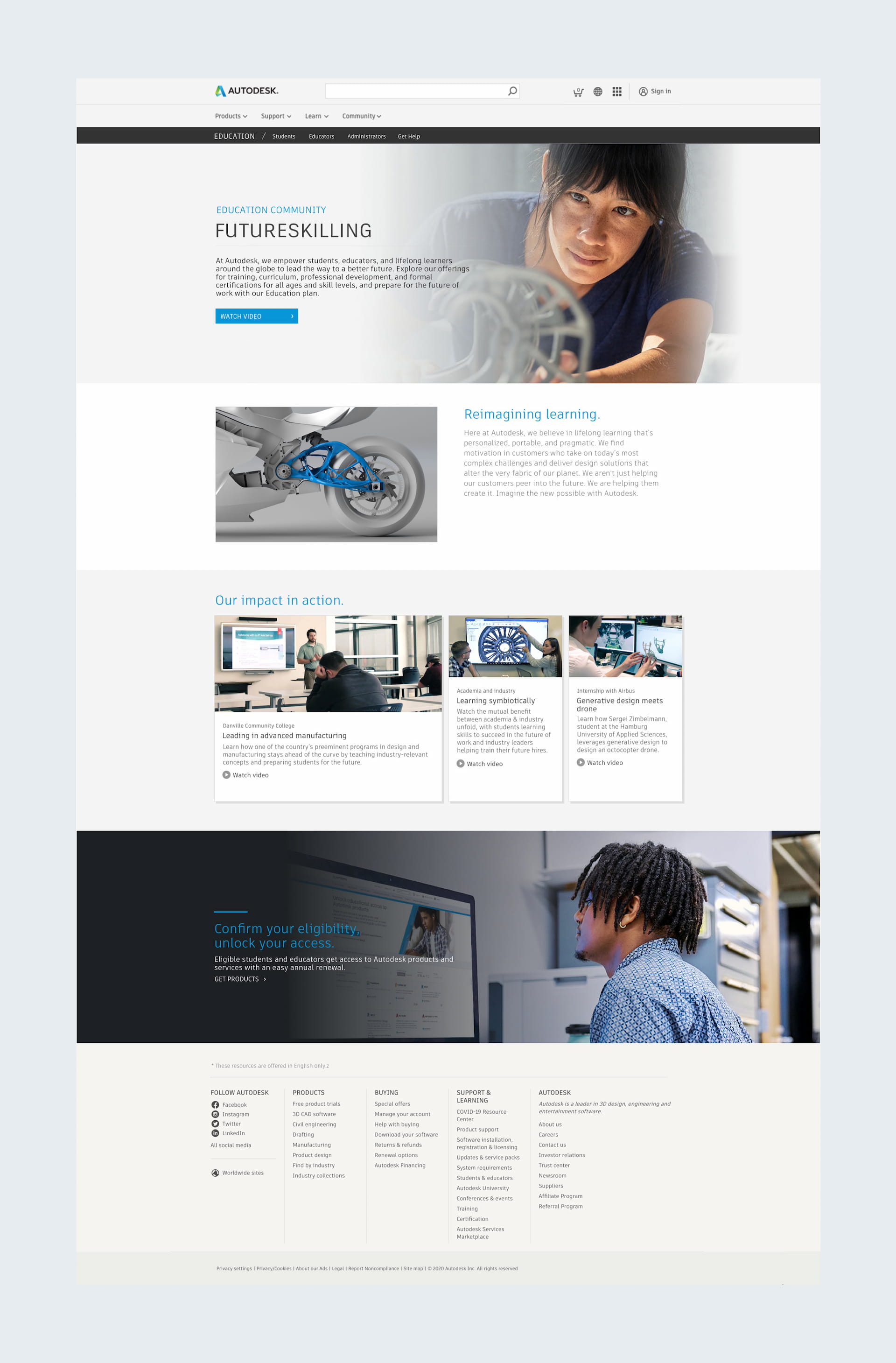
Although friction is usually a bad thing, in this case, a little friction turned out to hold the key. We removed “free software” from the navigation and instead guided audiences down different paths. There we inspired them with highly relevant content about Autodesk’s commitment to their audience — before they hit download.

Inspirational impact
You may notice that the primary CTA on the home page is not to get products. Instead, we kept the focus on demonstrating Autodesk’s commitment to education. We elevated Autodesk’s mission and showed them how Autodesk can help promote theirs. We elevated stories that showed Autodesk’s impact in the classroom and highlighted exciting programs and resources.

Boldium has been a fantastic partner to our team, from supporting small page updates to completely redesigning our site that sees millions of visits a year.
—
Sparking imagination
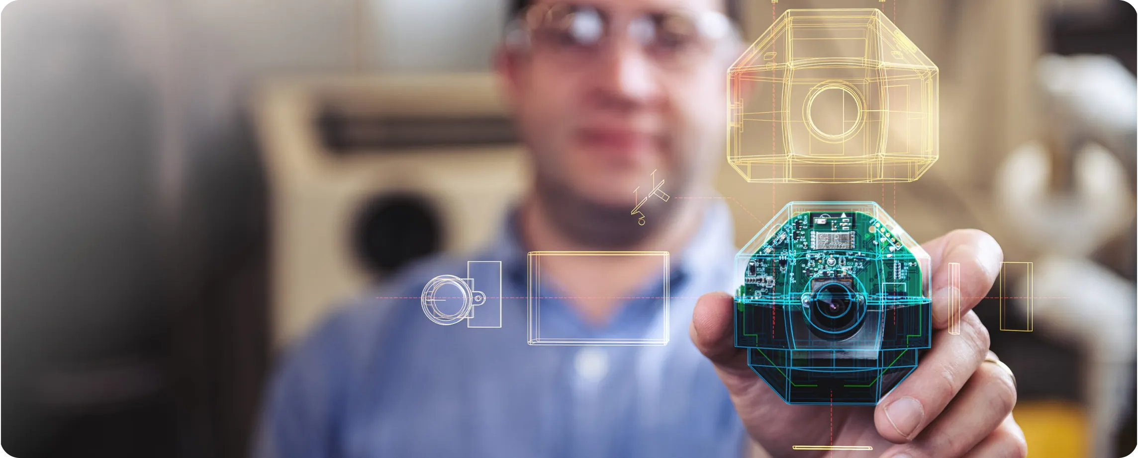
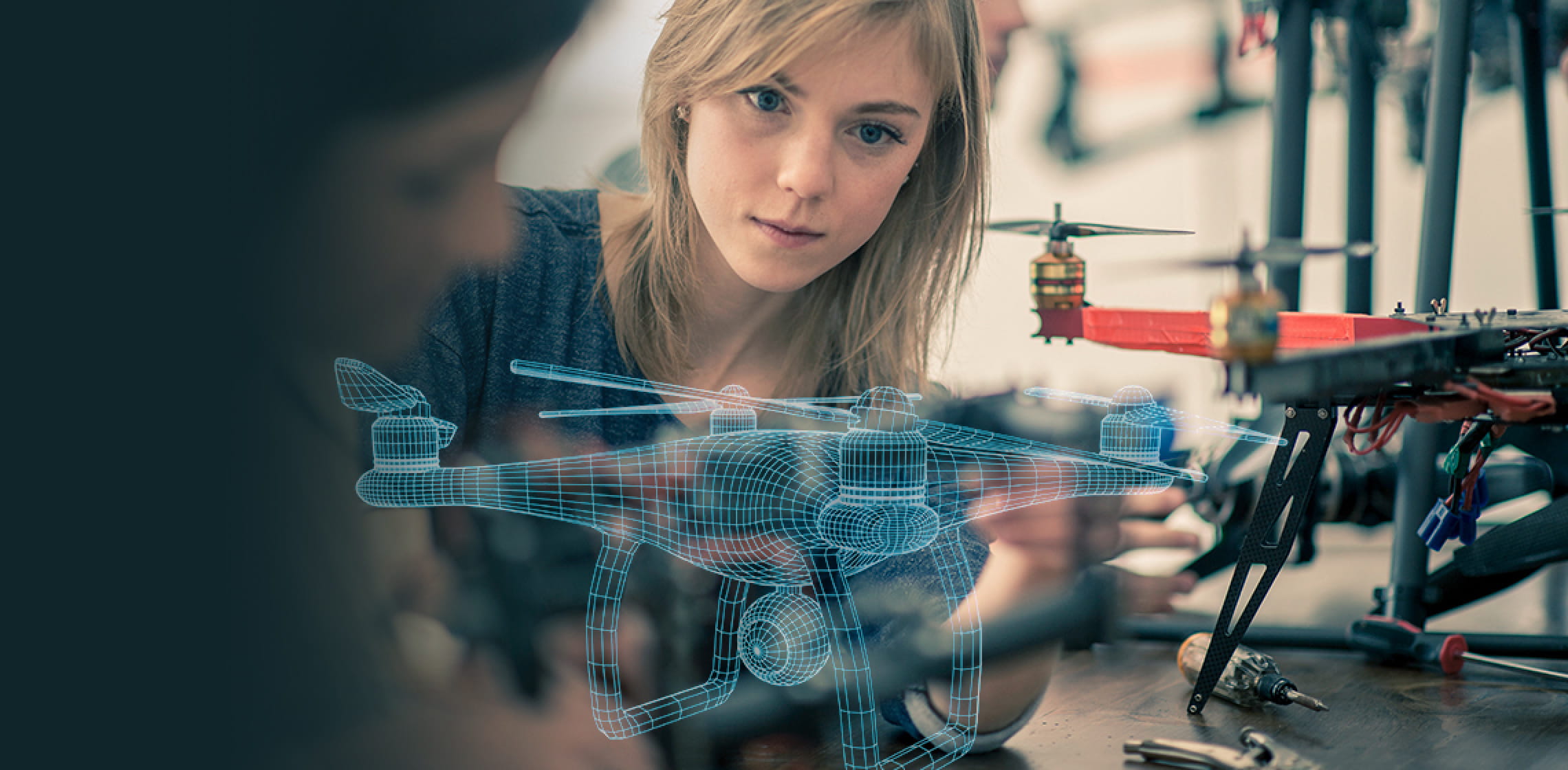
Through photography, we wanted to capture making in action. Rather than simply showing people with the objects they created, we added a graphic overlay treatment to show the thinking behind those objects. The futuristic feel worked well with the overall messaging for the site.

Guided pathways
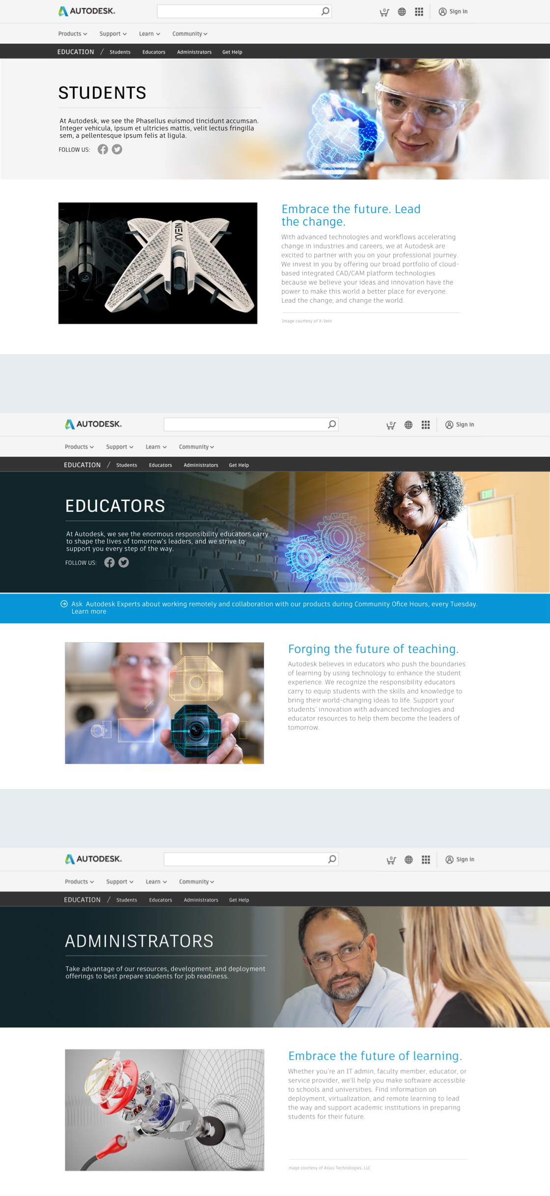
Our navigation strategy focused on catering to different audiences, and we considered the journeys within each section. Those who are new to design and make have different needs than those who have some experience, and every group needed to be able to find what they were looking for.

They [Boldium] are always up for whatever challenge we throw their way and their collaborative approach to working makes it feel like they are an extension of our team.
—
Design
- Creative direction
- UX/UI Design
- Visual Design
- Accessibility
Strategy
- Information architecture
- Personas
- Strategy Pillars
Content
- Content Strategy
Research
- Qualitative Interviews