Branch
Branch, a leader in mobile deep linking technology, set out to create a best-in-class search experience for Android users. They asked us to help them bring it to life.
The key insight
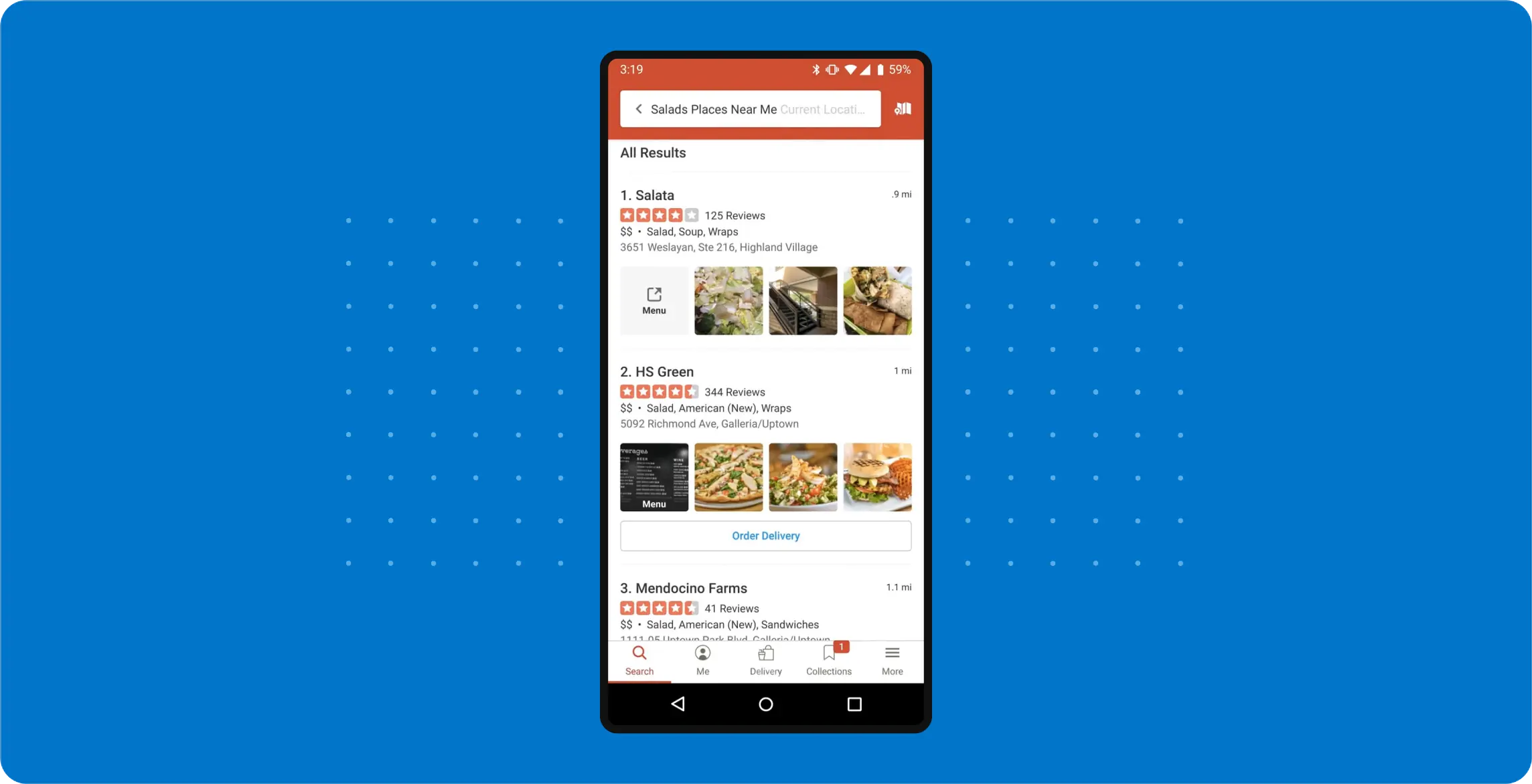
Branch’s technology allows users to search their mobile devices to find not only files, contacts, and apps — but also specific content within apps. We had to find a way to highlight this innovative feature without sacrificing the search experience’s overall utility.
The bold strategy
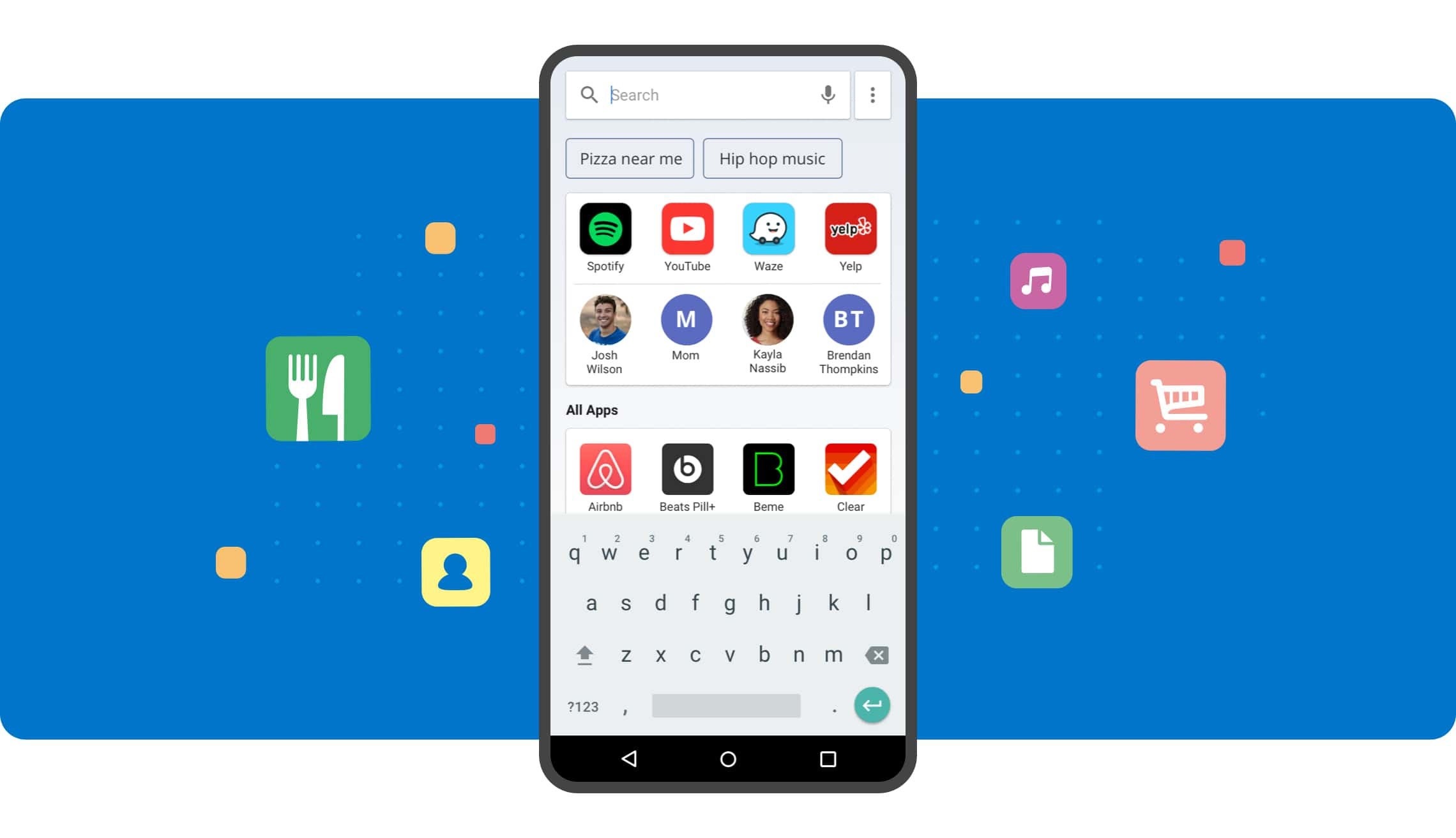
When users open a mobile device search experience, they expect to find apps and contacts. So we kept it that way — but we added suggested searches at the top of the screen as a way to discover in-app results. A suggested search like “pizza near me” was our way of sending users a simple message: that you can find more than you think if you just start typing.
Enticing users with delight
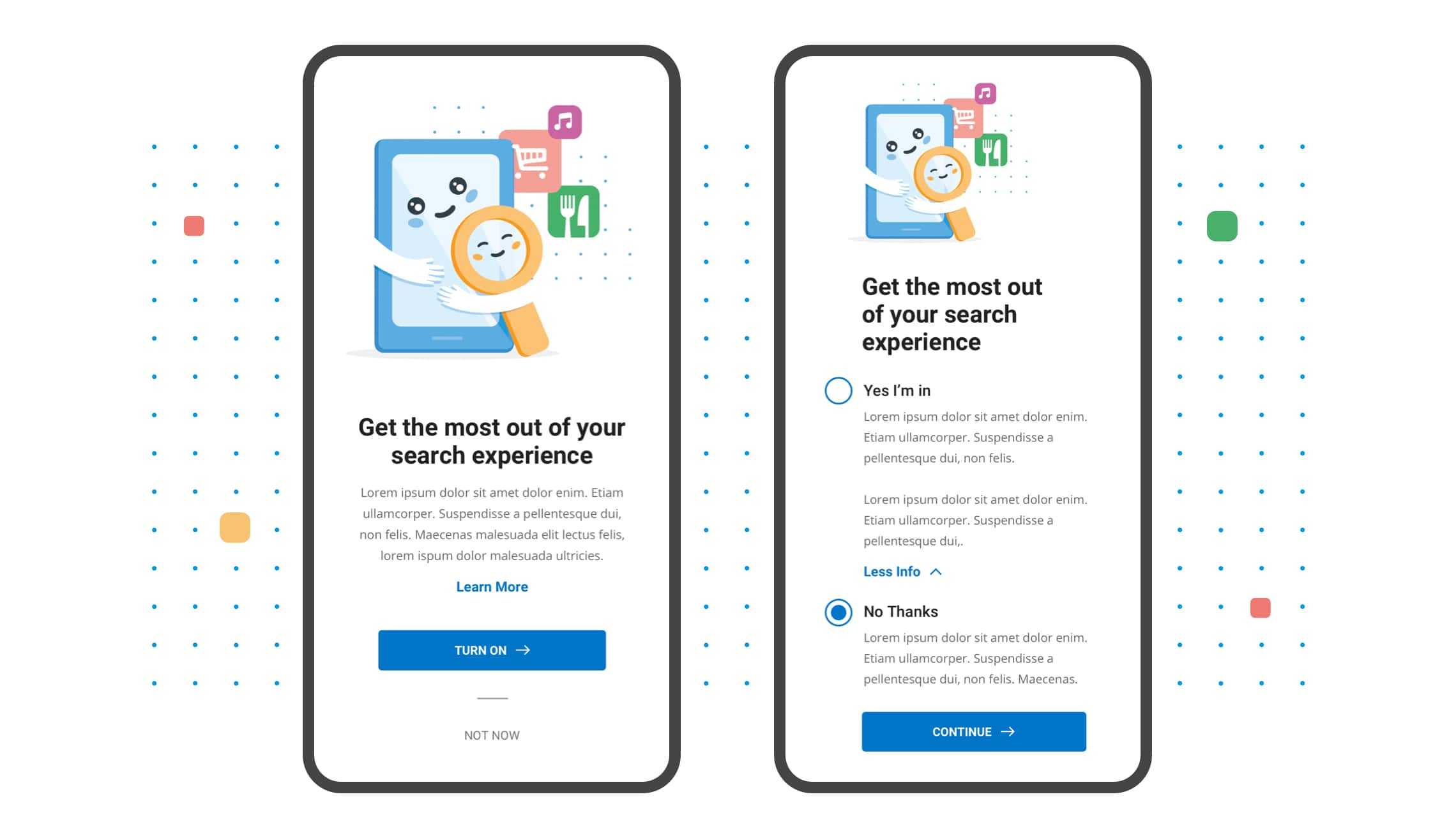
Android users are familiar with the app drawer, an alphabetical grid of every app on their device. This search experience was brand new to them — and they needed to opt in. We used a playful illustration style to highlight the benefits of activating a more robust search experience.
Diving deep with in-app results
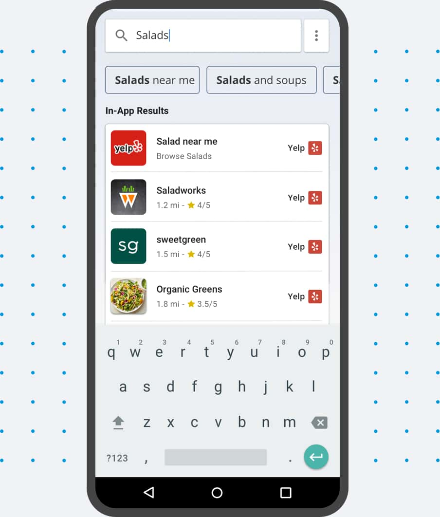
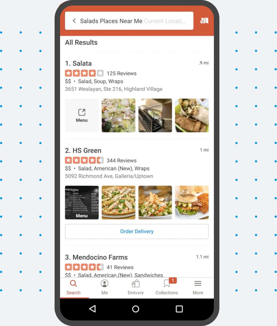
When you want to find a salad place, you might search for Yelp on your mobile device and open the app. Now, you can simply type “salad” — and compare Yelp results to every other food-related app. To highlight this feature, we created a simple design that emphasizes in-app results while maintaining the context of the apps themselves.
Boldium has been an amazing design partner for us. They recently helped us with a redesign of a strategic new product. The Boldium team took the time to really dig into the problem we're solving. Their effort led to a thoughtful new design which directly contributed to the product's accelerated momentum.
—
Step-by-step guidance
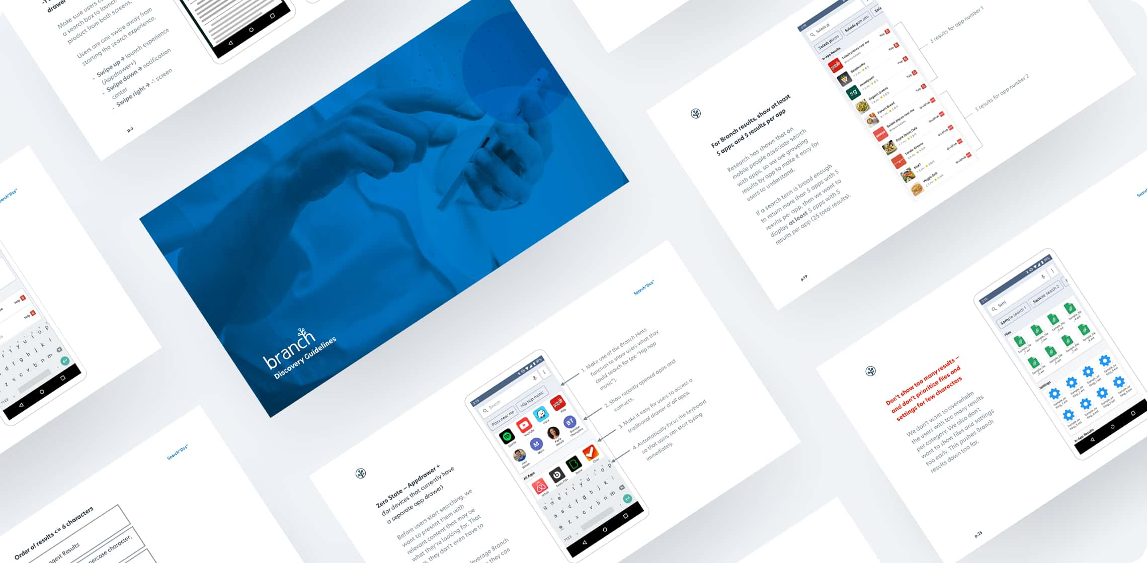
This technology is built into the devices themselves, so Branch needed a detailed guide that would help their partners implement it properly. We created a guidance document that included everything from character-based search logic to “dos and don’ts” to a demo video of how a typical search would work.
A flexible design approach
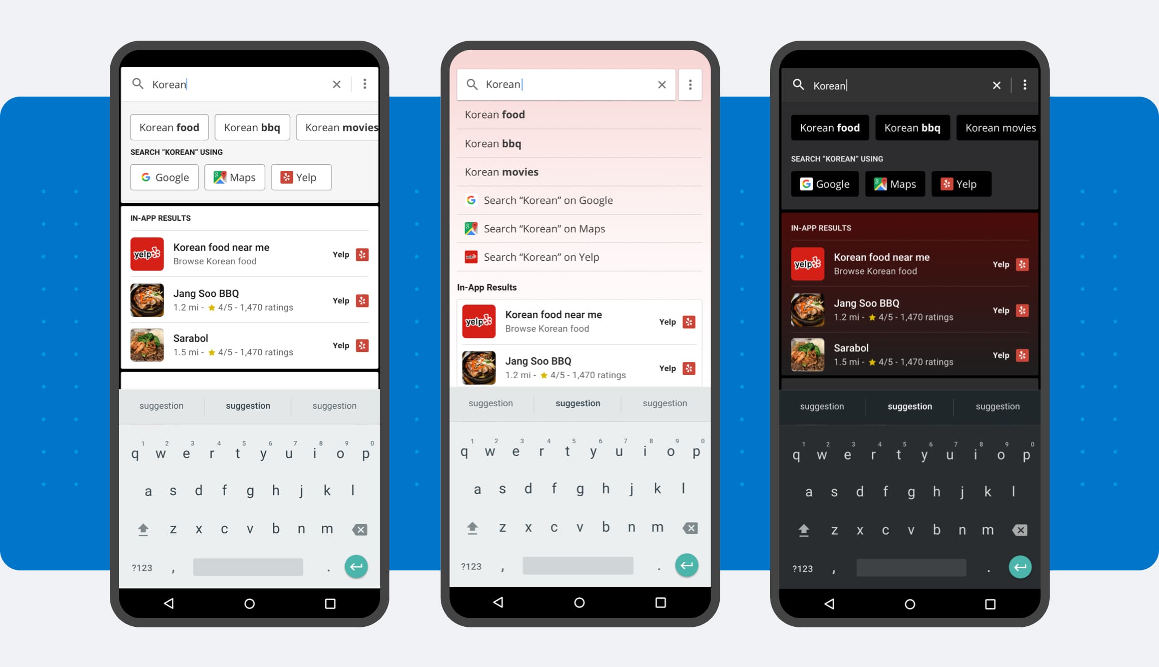
Each Branch partner has a unique device with a unique aesthetic for their existing screens. Knowing this experience had to work within these different design systems, we provided a variety of options — both light and dark — that we felt could work well.
Research
- Usability testing
- Qualitative interviews
Strategy
- Strategy pillars
- Personas
- Information architecture
- Feature roadmapping
Design
- UX/UI design
- Visual design
- Design optimization
- Creative direction
- Accessibility
Content
- Content strategy
- Copywriting