EOP
EO is a true pioneer in natural body products. But as more and more companies jumped on the natural products train, competition became tough. So they asked us to help guide a digital first marketing strategy.

The key insight
EO Products owes much of its success to unparalleled quality and integrity. Telling that story authentically was the key for EO Products to stand out from the trendy start-ups and large enterprises entering the scene.
The bold strategy
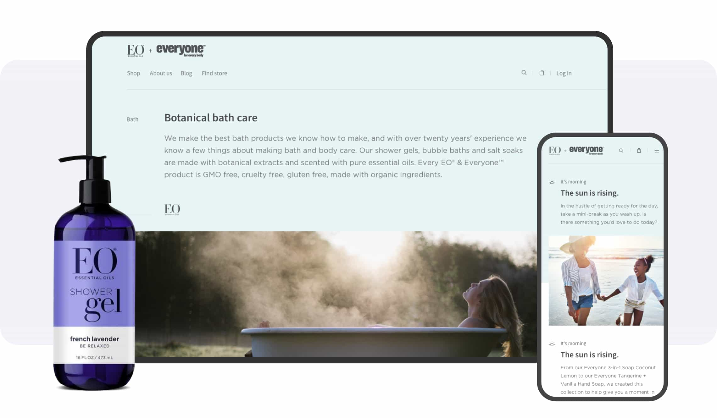
The most powerful way to tell a story is to enact it. For EO Products, we not only explained how essential oils and natural ingredients can create calm and balance, but we used the digital format to actually inspire these mini-moments.
In the moment. Literally.
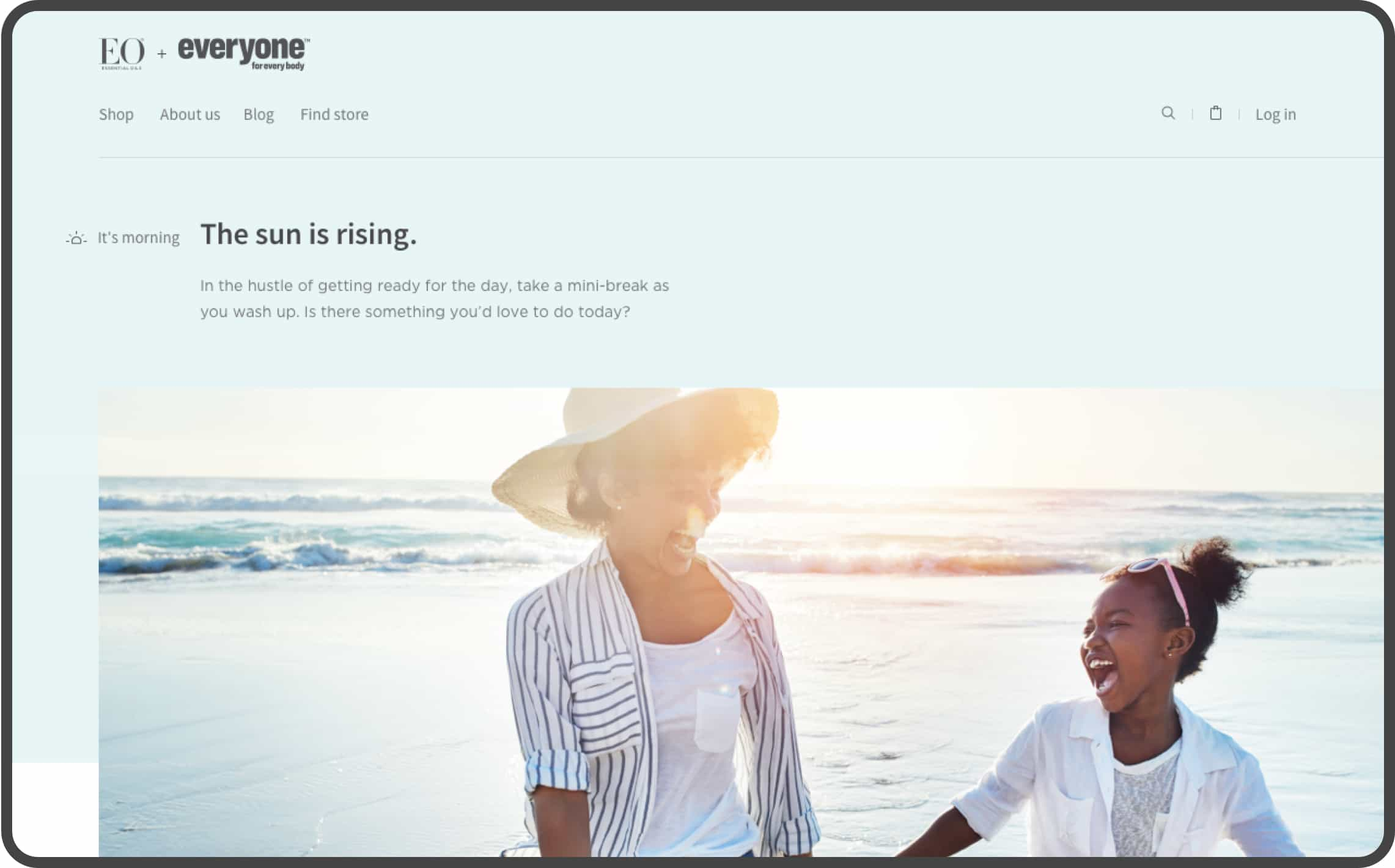
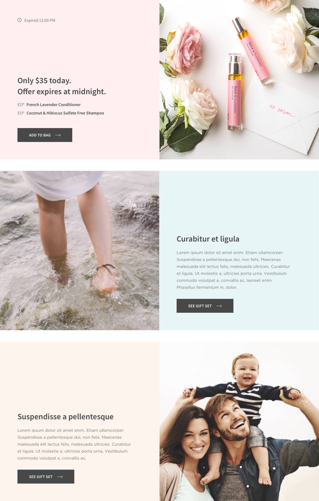
Starting with the hero, we served up a beautiful image and an inspiring message that was relevant for that moment in time (with the help of geolocation). The message to our audience was clear—take a deep breath, stay calm, and seize the moment. Just below the hero, we included an offer geared to the time of day that they could take advantage of.
Educating our audience
We also established a new brand voice that was informative, simple, and calm. Because every product has a unique story, we wrote over 100 descriptions explaining the benefits of natural products on your body, your mind, and the environment.

Easy to browse, easy to buy
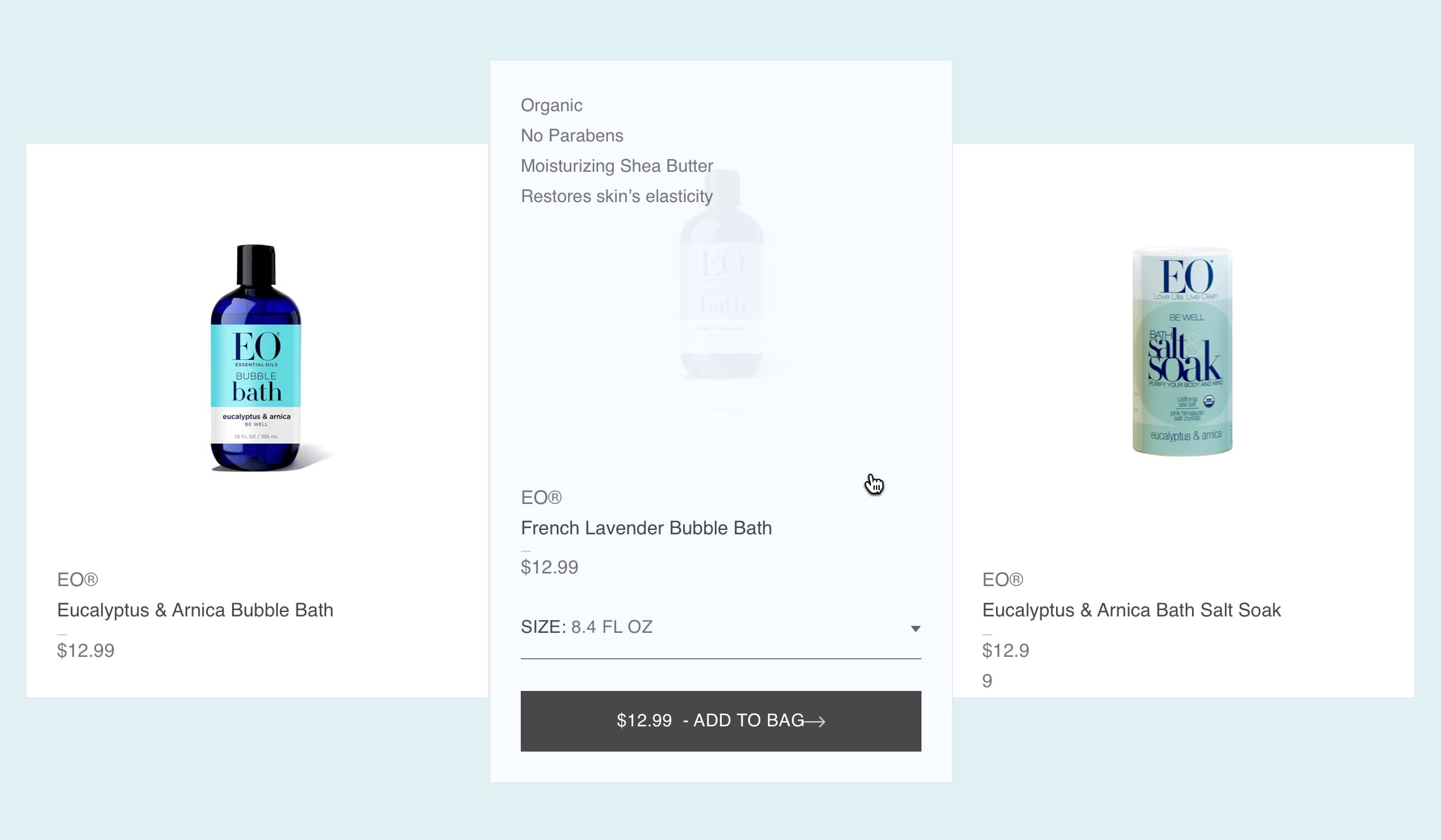
To see the essential benefits of any product, simply hover over it. From there, it’s extremely easy to pop what you like in your cart, right from the hover.
Building credibility
A lot of the upcomers are virtue signaling. When you talk to the founders of EO Product, it’s clear that their commitment runs deep. The key to building credibility was to tell their story, and tell it authentically, bringing in the nuances and the tensions. In addition, we created a unique illustration style to accompany the story that drew out the essence with honesty and simplicity.





Simple. Flexible. Accessible.
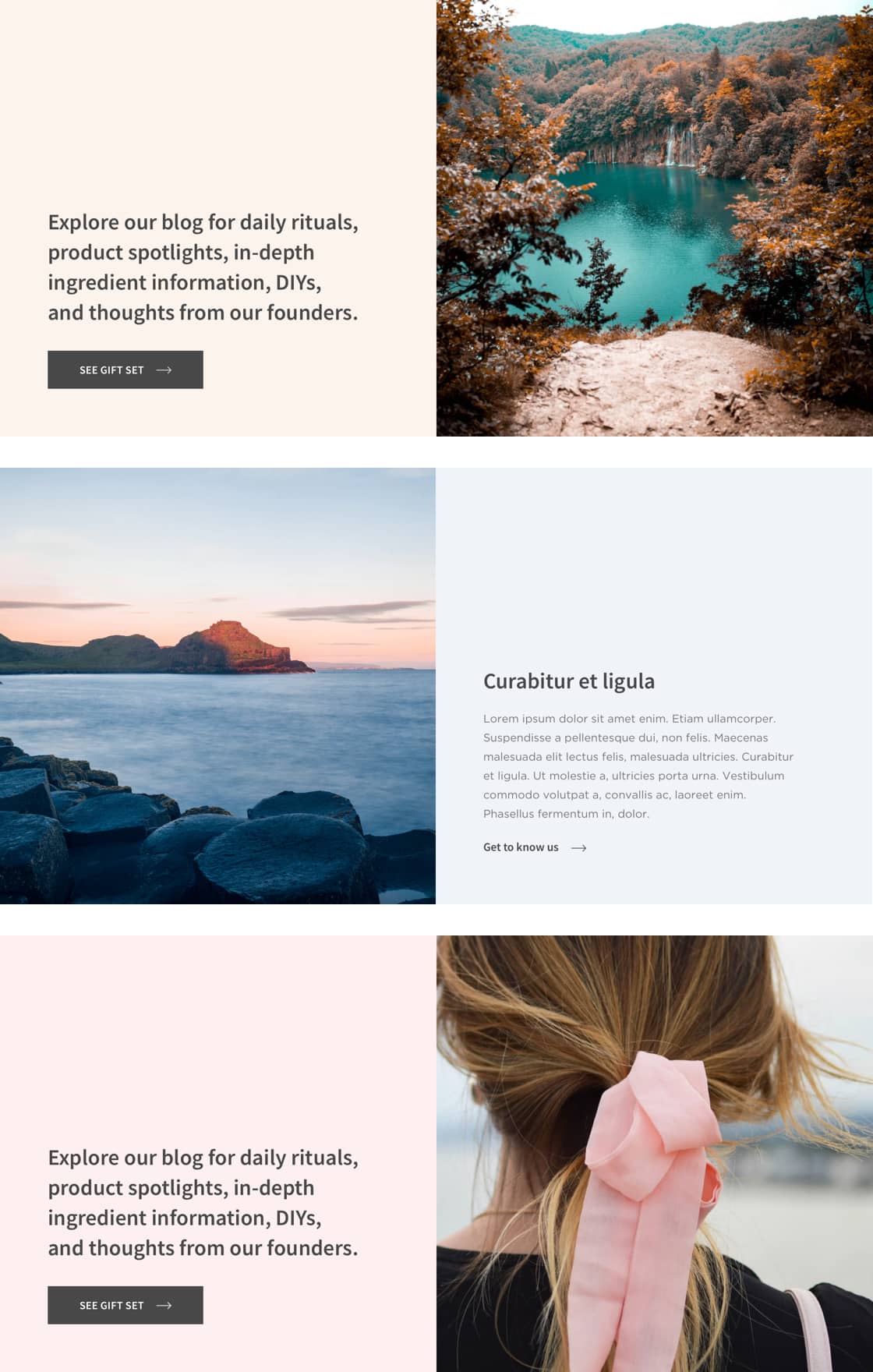
We created a simple, modular, and accessible component library that gave the EO team the building blocks to easily build the site they needed—and maintain it over time. So as new products and categories came onto the market, the team could build out specific landing pages to promote them.
Outperformed the previous website
30 %
increase in sales
40 %
increase in online purchases from both brands
Strategy
- Strategy pillars
- Feature roadmapping
- Information architecture
Design
- Creative direction
- UX/UI design
- Design optimization
- Visual design
- Motion design
Content
- Content Strategy
- Copywriting
- Shopify CMS