OSIsoft
OSIsoft has been leading the field of operational technology for decades. The problem was, their website looked like it had been around for decades too. So they came to us to reimagine their brand and redesign their site.

The key insight
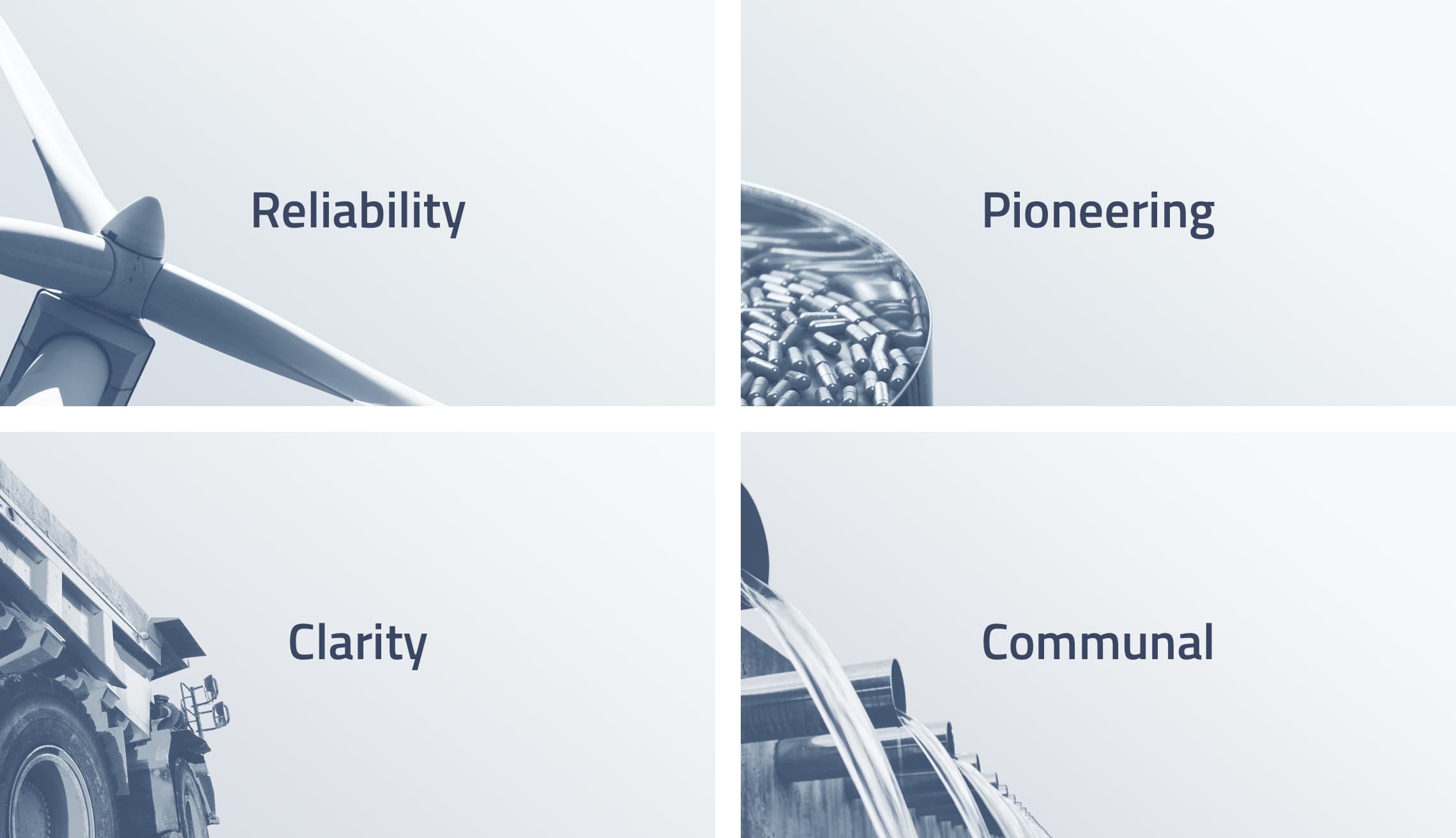
40 years can make you seem like a dinosaur. But when positioned the right way, OSIsoft’s longevity means they’ve been at the forefront of operational technology for decades. It means they're highly reliable. And they've grown a large community to prove it.
The bold strategy
Our strategy was to lean into the history of OSIsoft, positioning it as a signpost for two of the brand pillars we established—reliability and community. From color to tone of voice, we imbued the essence of the reliability and community into every layer of the brand.

Establishing the brand pillars
Our process began by interviewing brand advocates, insiders, and everyone in between. We walked a mile in their shoes and quickly identified their needs, their obstacles, and their purchase decisions. Then we created personas which developed into four strategic pillars for the brand, with actionable takeaways for each one.
The Boldium team has been the perfect fit of OSIsoft. Each of the Boldium team members have deep domain experience—design, UX, code, brand—and we exercised every inch of that talent!
—
Distilling complexity
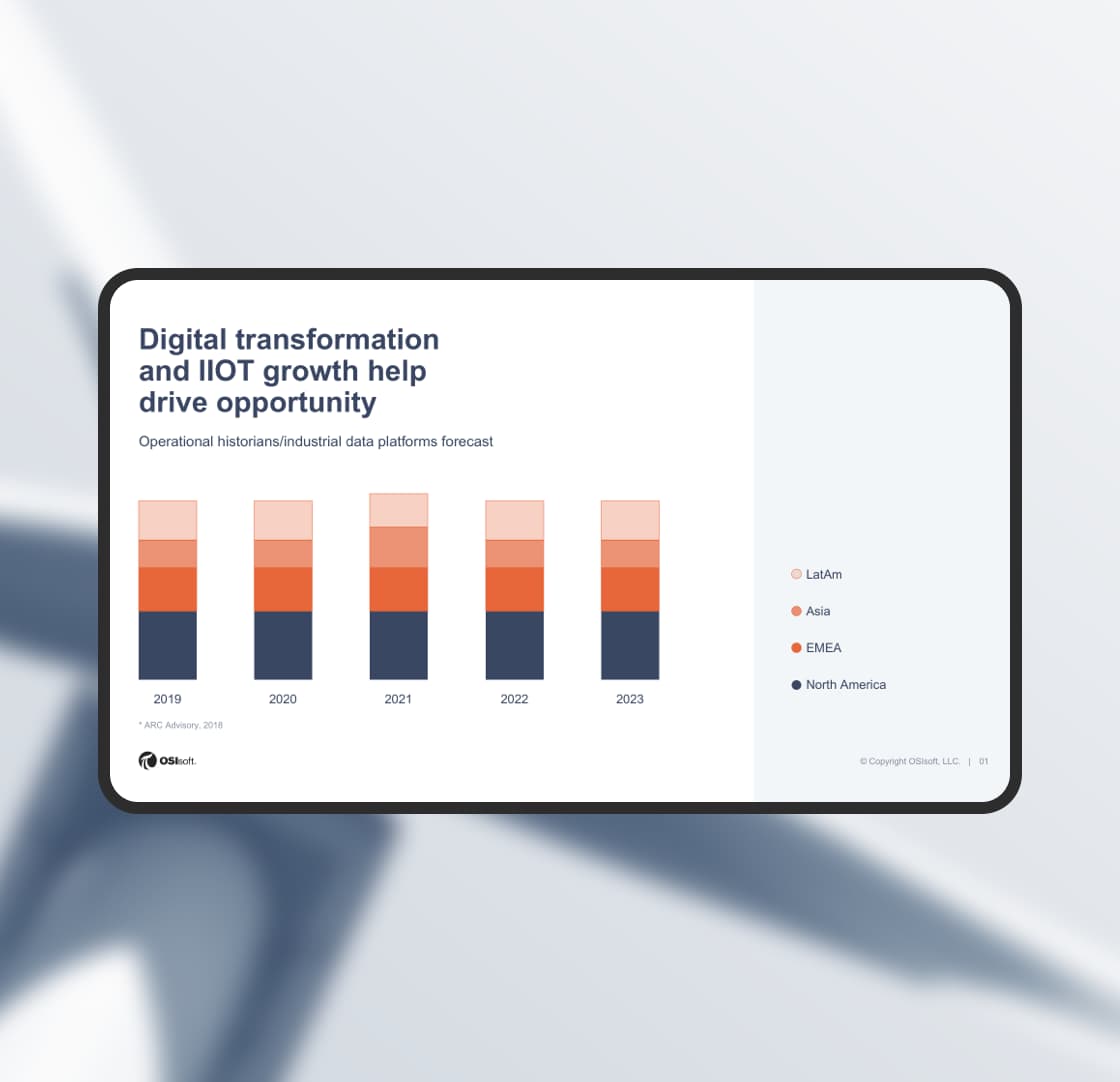
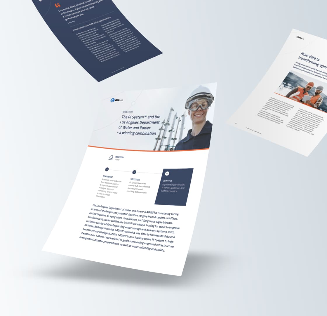
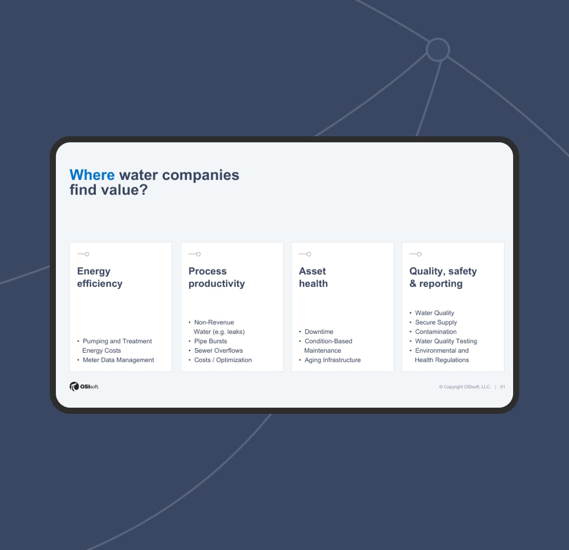
Some people are really good at distilling beer. For us, it's complexity. To understand how OSIsoft’s technology works, we dug deep into their database of customer stories, white papers, and videos. And then we dissected the technology story into a series of infographics and isometric illustrations.
Easy to use. Easy to scale.
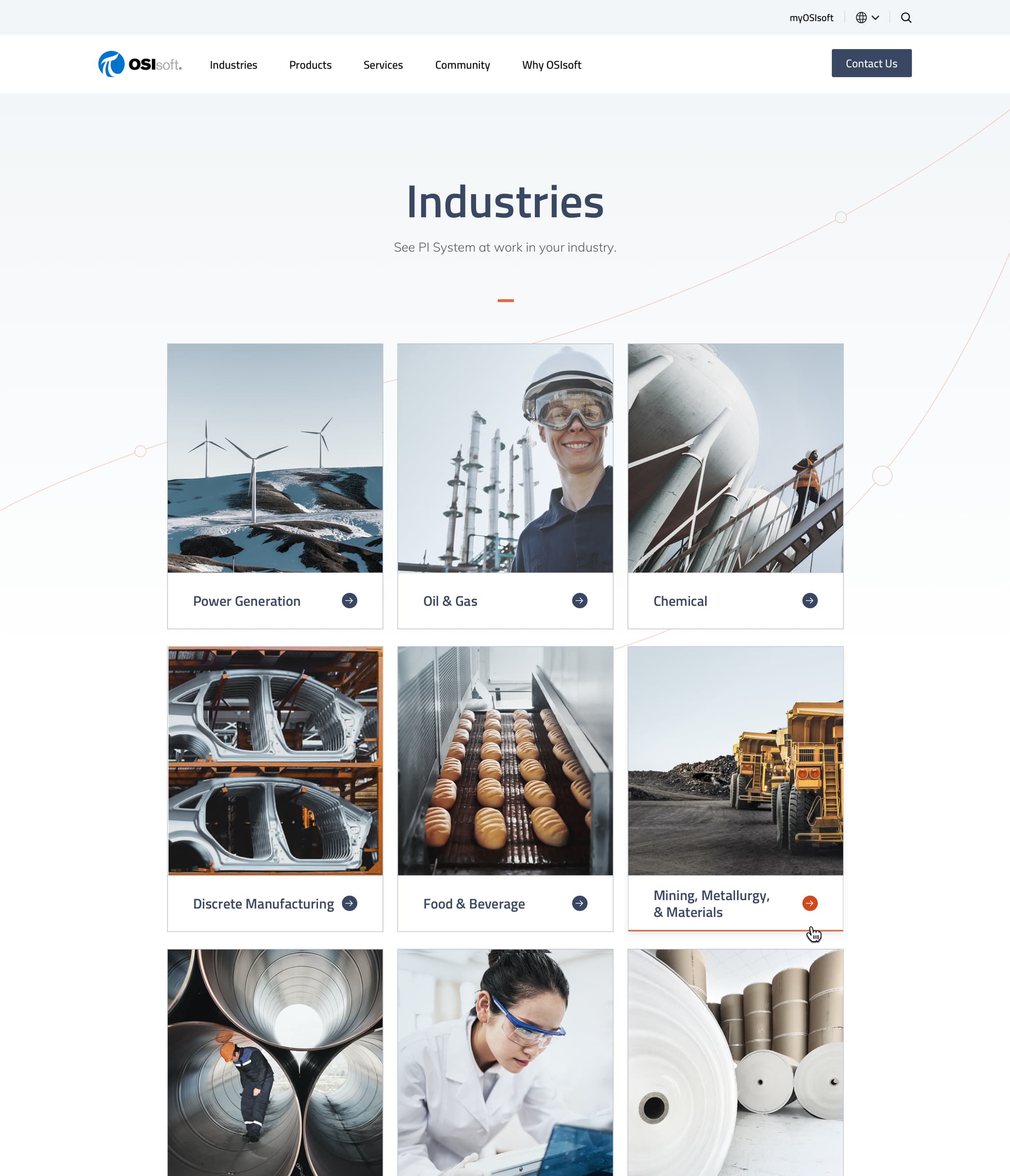
The key to designing such a large website (there are literally thousands of pages) is a deep understanding of the business, the audience, and how to prioritize content. We streamlined the navigation and strategically linked to deeper information on each page. We also designed the website to be modular, so as the company grows, the website can evolve while maintaining the integrity of the brand.
The color of reliability
The primary color for OSIsoft was a bright, cheerful blue. While it conveyed the friendly community vibe of the company, it missed the mark when it came to reliability. We kept the bright blue as an action color, and created a new primary color we called "steel blue." A bit more serious with undertones of the future, it carries both the heft and the pioneering spirit of the brand. We carry the color of "steel blue" through the treatment of photography and thick icons. We also added a color we call "attention orange" to help the audience cut to the chase and focus on what's most important.

The elements of a brand
We created a style of icons and brand signature elements to help the brand feel differentiated and connected to the audience. A "data node" background element gives the brand a character while reinforcing the brand's mission to bring together disparate data. It depicts small data nodes traveling across the curves in the logo.

Together we worked as a single, collaborate team to push our company into a forward-leaning brand in an otherwise backward-leaning industry. The result shows up as a highly targeted, very direct brand experience that aligns with the sensibilities of our customers. We couldn’t be happier.
—
Branding
- Branding strategy
- Visual branding
- Verbal branding
Content
- Content strategy
- Copywriting
Strategy
- Strategy pillars
- Feature roadmapping
- Information architecture
Design
- Creative direction
- UX/UI design
- Visual design
- Motion design
- Accessibility
Engineering
- Technical strategy
- Systems architecture
- Front-end development
- Back-end development
- Quality assurance