
I spent many years as a designer not fully aware of the importance of accessibility—and I regret it. So I want to share my own personal story in order to help others understand how many people are affected by “good” designs that aren’t accessible.
I started designing in Europe many years ago. For a long time, the subject of accessibility was overlooked there and there were no specific regulations on this subject. Stories about huge amounts paid out as compensation by large companies in the United States were treated as slightly made up stories from overseas.
Despite this, I always wanted to make sure my designs were very intuitive and friendly for users. I used to think of my mother as a reference point, wondering if she would navigate the page without any problems. I would ask myself if the fonts were large and the information consistent. This made me feel like I was being sensitive to the needs of others.
Everything changed when I started my work at Boldium and I began to work with clients based in the U.S. Some of my designs were challenged by my colleagues at Boldium for not being accessible. In the beginning, I confess that I experienced a lot of resistance inside of me. I was especially upset about color—I wanted to be able to use my favorite orange on a white background, or I wanted to use nice pastels as link colors.
As I rarely trust someone else's word, I decided to dive into the topic of accessibility on my own to really understand it. I started doing research with the group that is most closely related to the subject of colors—people with color blindness, also known as Daltonism.
According to statistics on color blindness, it is a problem for about 4.5% of the population (8% of men and 0.5% of women). This data shows that almost every twelfth man suffers from color blindness. This surprised me since I knew a lot of men but I didn’t know anyone who was color blind. I started searching among my friends and quickly found someone who was colorblind but never talked about it. After a short discussion, I immediately understood the difficulty I was creating for someone like him with some of my favorite colors. I felt very bad and was ashamed that I had never explored this topic before.
I quickly realized that nice design is not always good design. By creating products without understanding the limitations of other people, we can unconsciously contribute to excluding them from the use of a given product or feature.
Color blindness is just one of many groups of people whose needs need to be considered when designing. Some other groups include:
- People with color blindness
- People with motor disorders
- Deaf people
- Low vision or blind people
- People with dyslexia
- People with the spectrum of autistic disorders
The groups of people who are impacted by inaccessible designs is actually even more extensive as screen visibility also depends on the conditions of use. For example, every one of us has operated a phone in the sun, or tried to write a message holding a shopping bag in one hand and a telephone in the other. These conditions also affect the quality of use of a given product. Some temporary situations could include:
- An ear infection
- A broken finger
- When we are in a place where we do not want to disturb others
- In places where it is very loud (then we often watch movies with subtitles)
- When we visit a website written not in our native language
- Hardware limitations, e.g. operating the computer without a mouse, etc.
The number of situations and conditions that can make it difficult to interact with a website are endless—and everyone experiences some difficulty at some point. I have now become passionate about creating designs that are both beautiful and accessible.
If you are like me and you don’t believe everything you read, I encourage you to do your own research. Start asking your friends and family to get a deeper understanding of the difficulties people encounter when interacting with websites and apps.
And I want to leave you with some of what I believe are the most important aspects of accessibility that have changed the way I design.
Accessible design tips
Color contrast
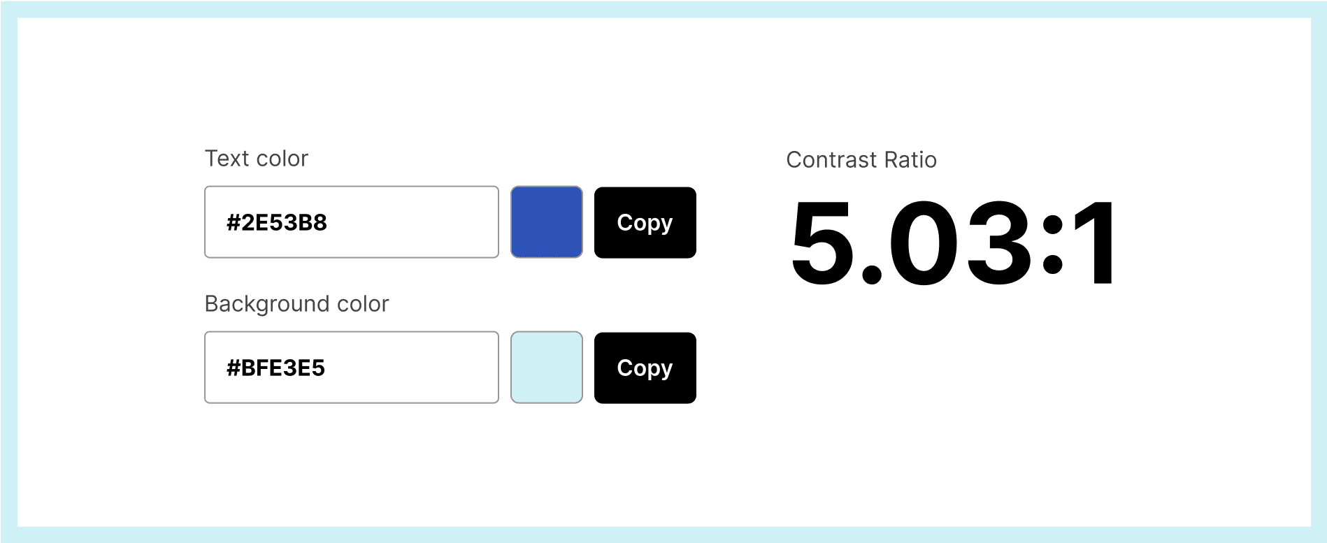
It is important that the color contrast is sufficiently high. The WCAG (Web Content Accessibility Guidelines) standard is 4.5:1 for small texts, and 3.0:1 for large or bold texts and interface elements. Appropriate contrast will significantly facilitate the use of websites for people with limitations, or who are viewing websites in sub-optimal conditions.
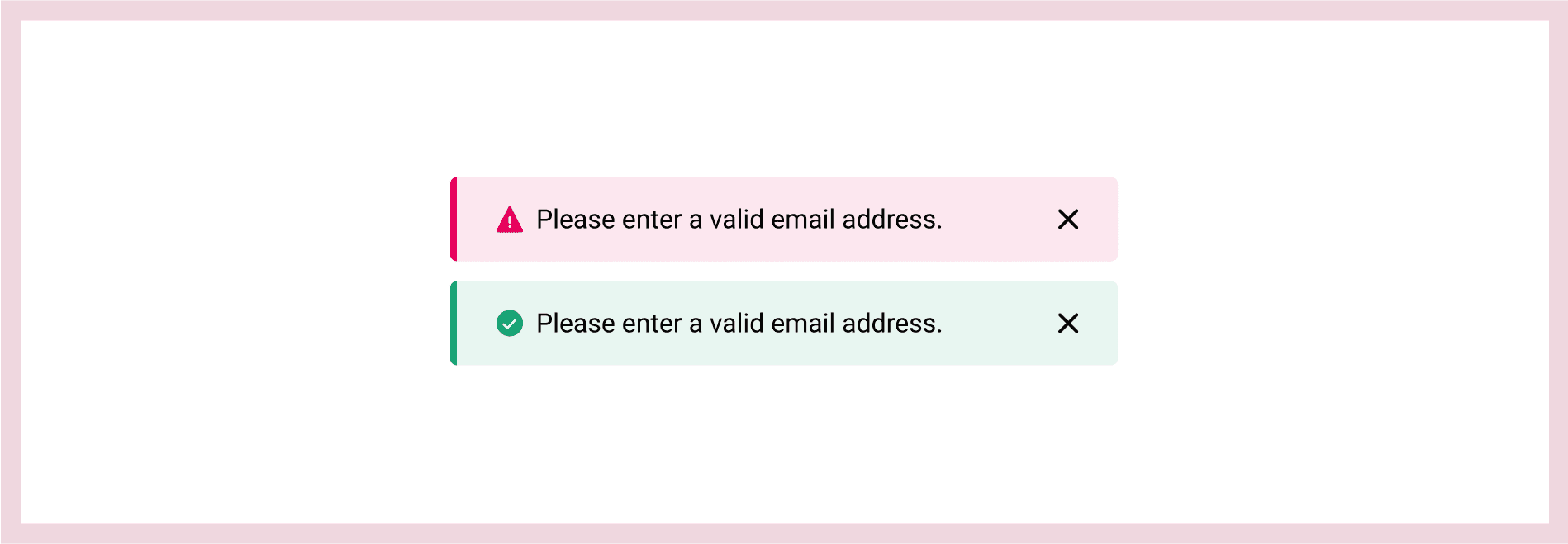
Add graphic elements. Don't just rely on color
Even with the appropriate level of contrast, people suffering from color blindness may have problems distinguishing some colors from others. For this reason, it’s important to add an additional graphic element e.g. adding an arrow or underline next to links, an icon with an exclamation point next to an error message, or an additional bold for a text frame when the input state is active. If you create charts, it is worth adding an additional pattern to distinguish individual sections from each other.
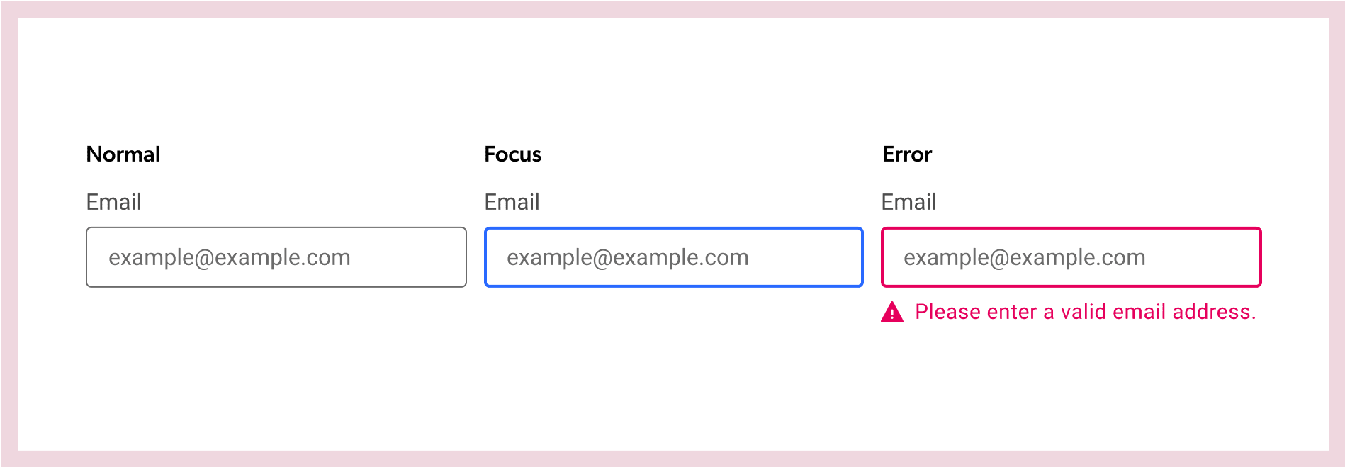
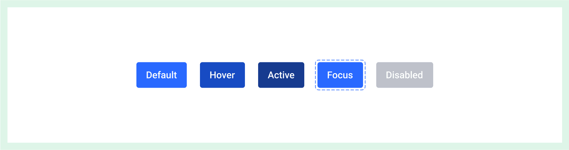
Styles for different states
Users can access websites in many ways: by using a mouse, a keyboard or a screen reader. Therefore, all clickable/active elements should be well exposed and have different styles for individual states—a different style when hovering over the mouse and a different one showing the focus state, etc.
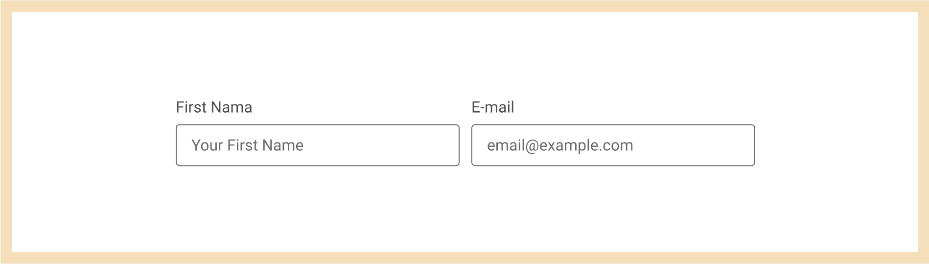
Labels and additional descriptions
Text field labels should always be visible, and their language should be easy to understand. The additional descriptions should be brief and should assist the user in completing the form by providing all the necessary information.
Website language
The text throughout the page should be concise and simple. Texts on interactive elements deserve special attention, as they should be clear and easy to convey. Avoid vague expressions such as "click here", etc. The text on the buttons should clearly define the type of action and the links to their destination. Instead of creating complicated layouts, choose simple text blocks that help to focus the reader's attention in the desired place. Remember that not all users are native speakers, so it is important that the language of the site is clear and not complicated. It is also worth considering the selection of the font. Small fonts are more troublesome for people with low vision, and reading them will take longer. With long text it is better to choose a simple font instead of a decorative one—it is much easier to read. Fun fact: there are even special fonts designed for people with dyslexia.
Clickable fields
The clickable field for buttons should not be smaller than 44x44px. Why? As I mentioned above, when operating a phone in difficult conditions it's hard to hit/click in the right place. When the clickable fields are small and we have a lot of clickable elements next to each other, this task becomes really difficult. People with motor disorders experience this type of problem every day, which is why it is so important that the clickable space is large enough. The same applies to computers—make sure that all clickable elements have a sufficiently large clickable box.

Notifications
Always inform users of the activities they perform. For example, when they fill out a form and click the send button, it is worth adding information confirming that the message was sent. The same goes for error messages. All messages should be simple and easy to understand. If we use pop-up notifications, always do it without a time limit. Disappearing notifications sometimes disappear too quickly, causing users to miss important information. We can always add a "close" button, that way we can be sure that no one has missed the message.
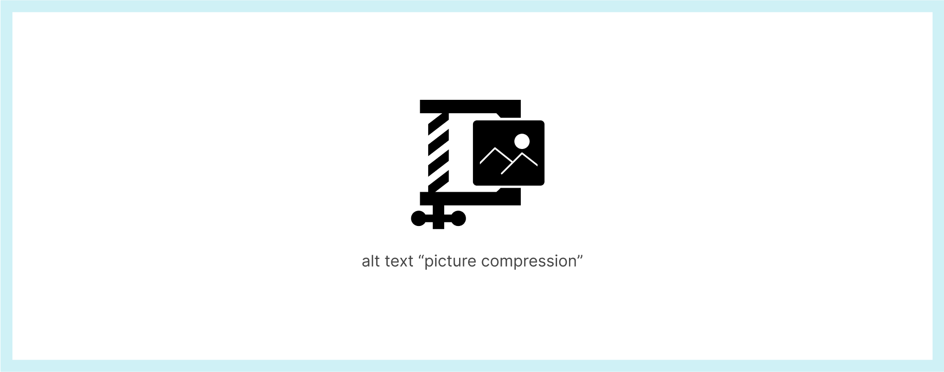
Alternative text for photos and graphics
Many pages contain a large number of photos and graphics. Remember to add descriptions of photos and graphics that describe the information presented in the photo for people using screen readers.
Video
All kinds of videos on the site should have subtitles. How frustrating would it be to watch a film with no sound, and no subtitles? This problem applies not only to people with hearing problems, but also to users who play a movie in public places, and are watching the movie without sound to not disturb others.
Great design is accessible design
As technology takes on an increasing role in our lives, it is very important to adapt it to the largest possible group of recipients. We need to continue to understand every individual’s needs so we can design websites and apps in a way that will allow everyone to access them.
There are many additional benefits that companies are now coming to understand about accessible design. It not only strengthens the usability of websites, but it also expands the potential group of recipients, improves SEO metrics (e.g. with alt text and video transcripts), and thus ultimately drives growth.
This is all true, however, in my opinion, accessibility is more of a foundation for design than an added value. Accessibility applies to all of us, so we should all work together on it. I’ve come to realize that great design means accessible design.