LifePlus
LifePlus created the technology for the first smart watch capable of detecting blood glucose levels with the touch of skin. They asked us to create the UX/UI design, visual design and branding for the smartwatch, app, and website—from the ground up. We couldn't have been more excited to help.
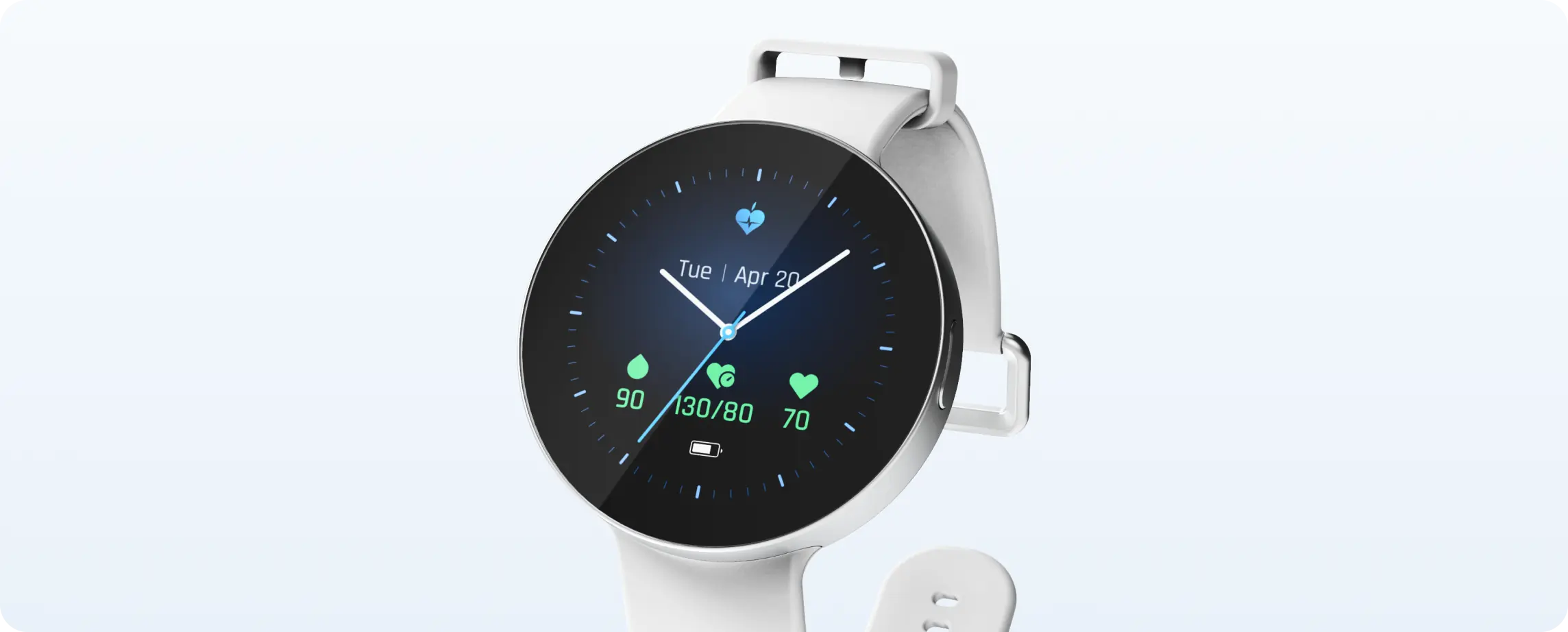
The key insight
Many people with chronic conditions, especially diabetes, think about their disease 24/7. We saw an opportunity not only to ease the burden of constantly monitoring symptoms with finger pricks, blood pressure checks, etc., but to relieve the stress of constantly worrying about health.
The bold strategy
The key to the design was simplicity. And the key to simplicity was the complex decision process of prioritization. We needed to prioritize what notifications users received to avoid notification fatigue. And we needed to prioritize what views of the data are most important, to make it extremely easy to understand and share key data points.
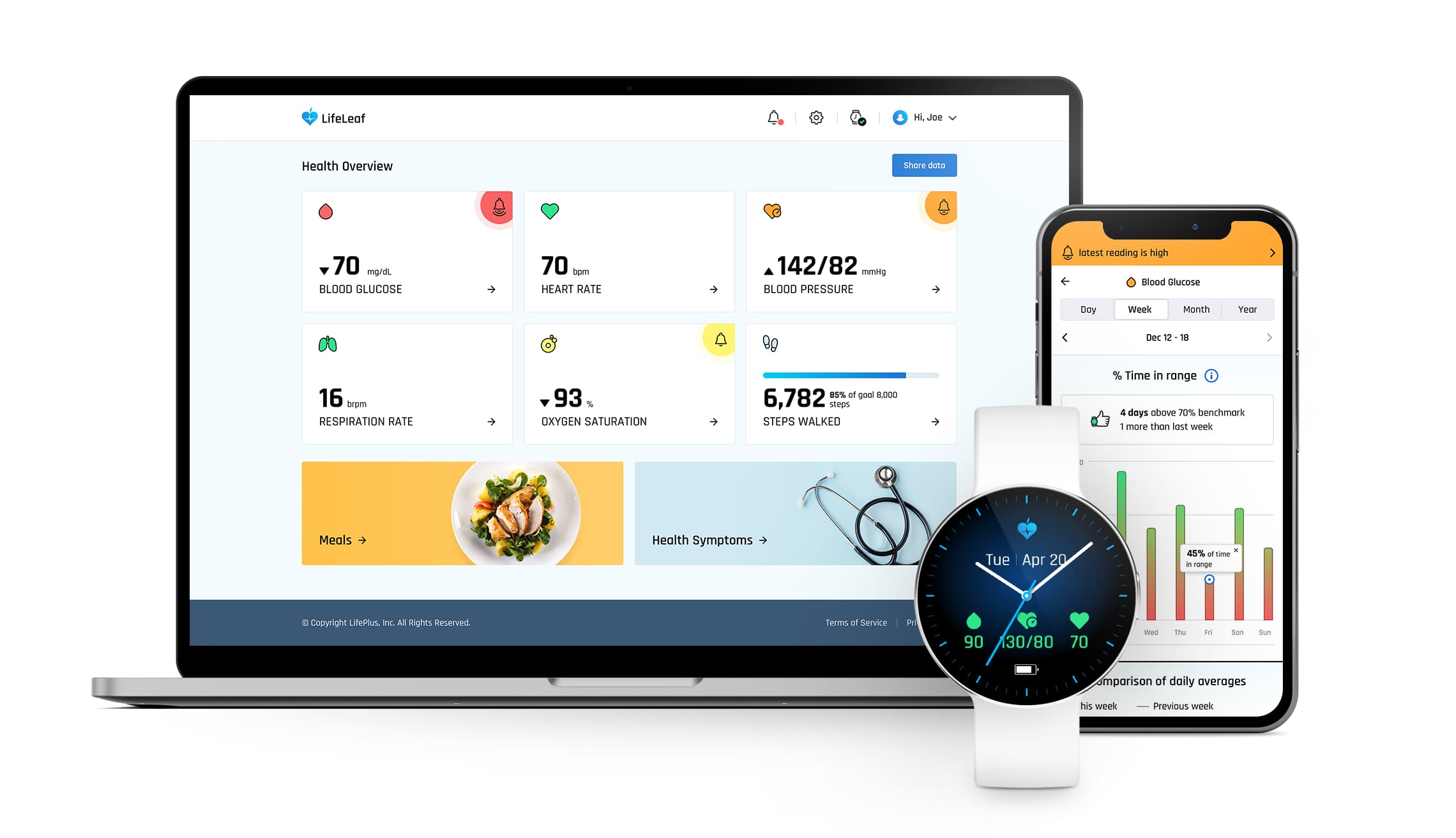
From design to delight
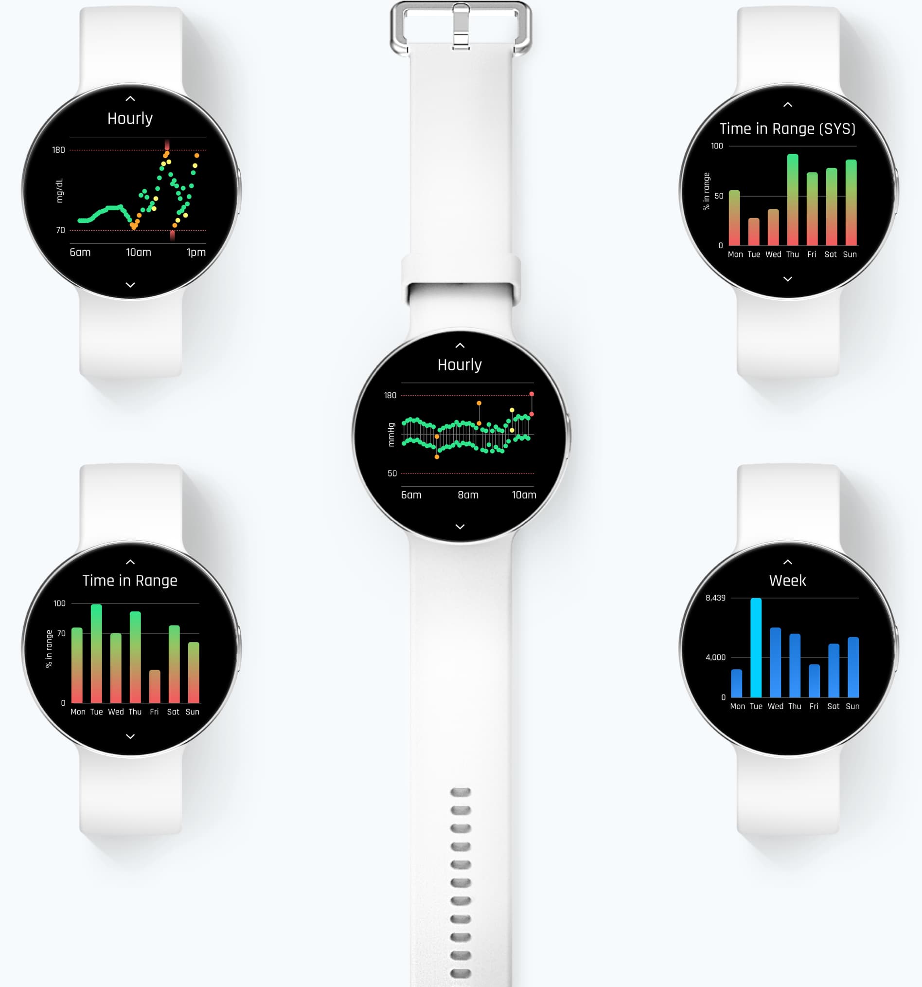
To help people understand how their behaviors impact their health, we designed dozens of data visualizations to get to the ones that were easiest to understand, most impactful, and full of delight. Because the more delightful it is to interact with the data, the more likely users will be to learn from it.
The power of nudges
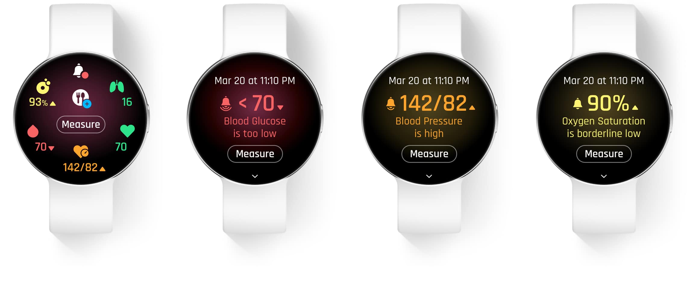
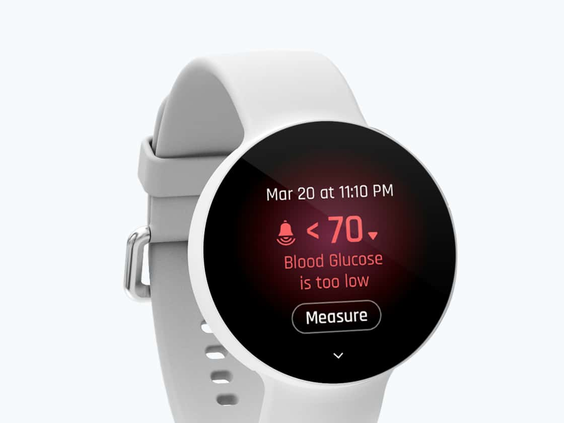
Nudges are key to helping people feel in control of their health. At the same time, when people are nudged too often, they ignore them and lose control. We collaborated closely with the LifePlus team to ensure nudges were designed so they would come at the right moments, with the right messages.
Boldium is full of extremely talented and creative artists who are meticulous. They collaborated closely with us as one team to create an elegant, unique experience that’s never been done before.
—
A watch face for everyone
Wearing something on your body is very personal. It has to feel like you. But people have so many different needs and styles—some want to see data big and bold; others want to be discreet. Some prefer a modern watch design; others more classic. And yet, we couldn't make twenty-five watch faces for an MVP. So we came up with five visual treatments to span the personal needs and styles of our audience.

Easy peasy
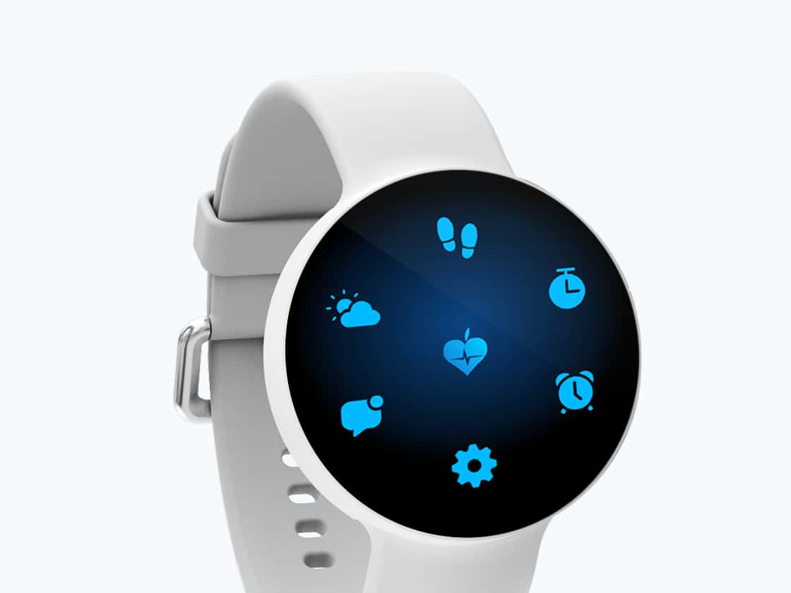
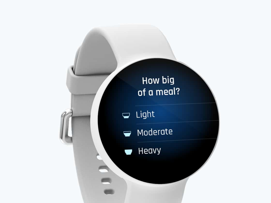
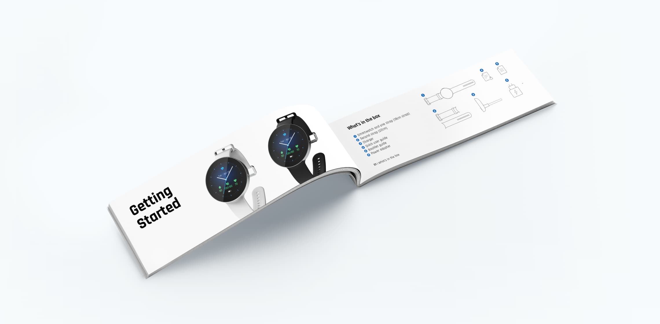
We designed everything to feel extremely easy. Every swipe and interaction delivers on expectations. A simple icon system makes it easy to add the size of meals. Color signifies severity, but we added additional signals for reinforcement, and for the colorblind. We also designed additional apps so users can get to all the information they need on their wrist. And to wrap it up, we designed a start-up guide to help people quickly find everything they need to know about using the watch.
Going to market
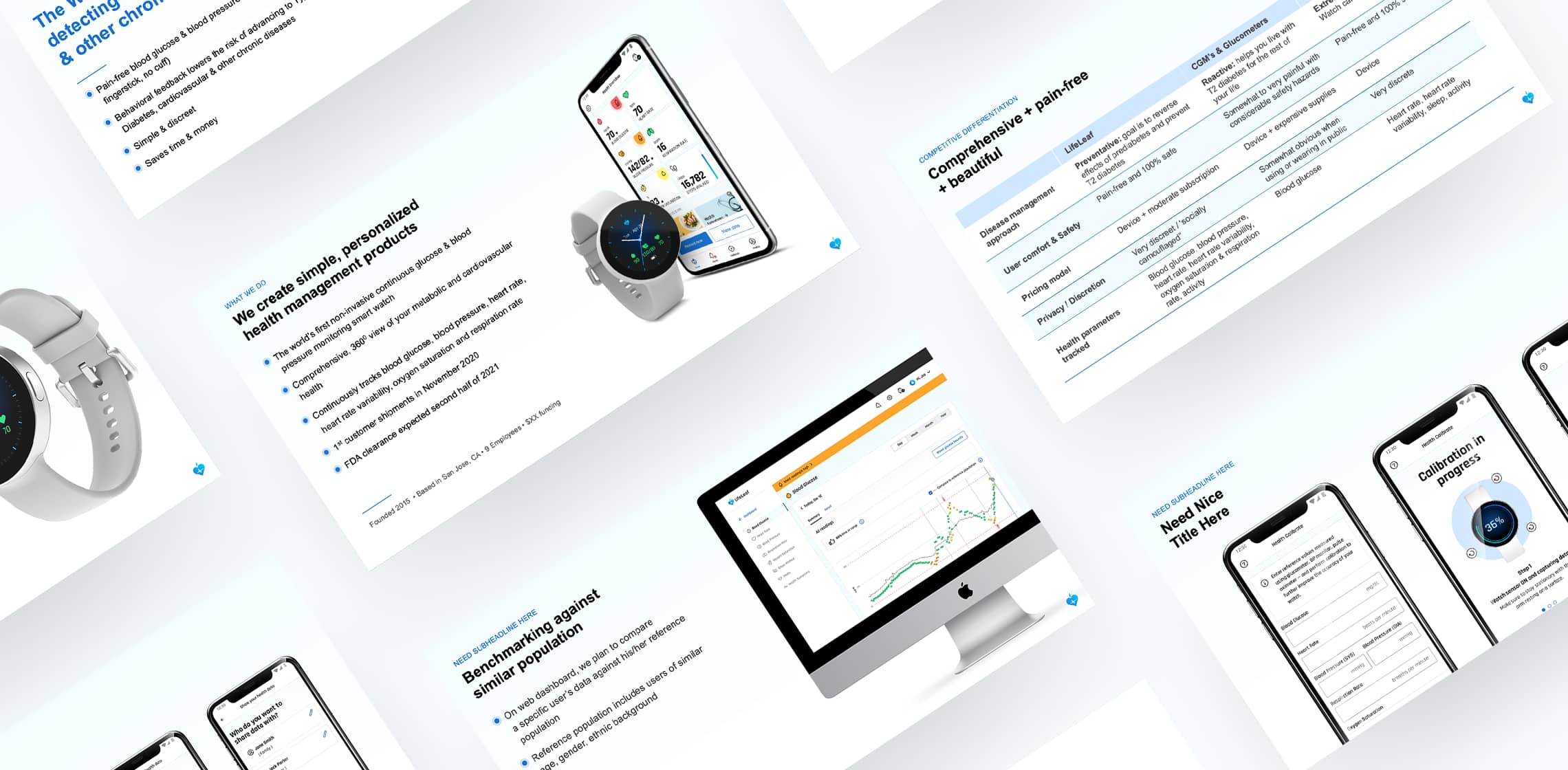
Finally, we partnered with the team to develop a go-to-market strategy. From help defining the positioning and the value proposition of the product to making the business case to potential investors to designing the investor deck.
Branding
- Brand strategy
- Visual branding
Strategy
- Strategy pillars
- Information architecture
Design
- Creative direction
- UX/UI design
- Visual design
- Design optimization
Content
- Content strategy
- Copywriting
Research
- Usability testing
- Qualitative interviews