Medforce
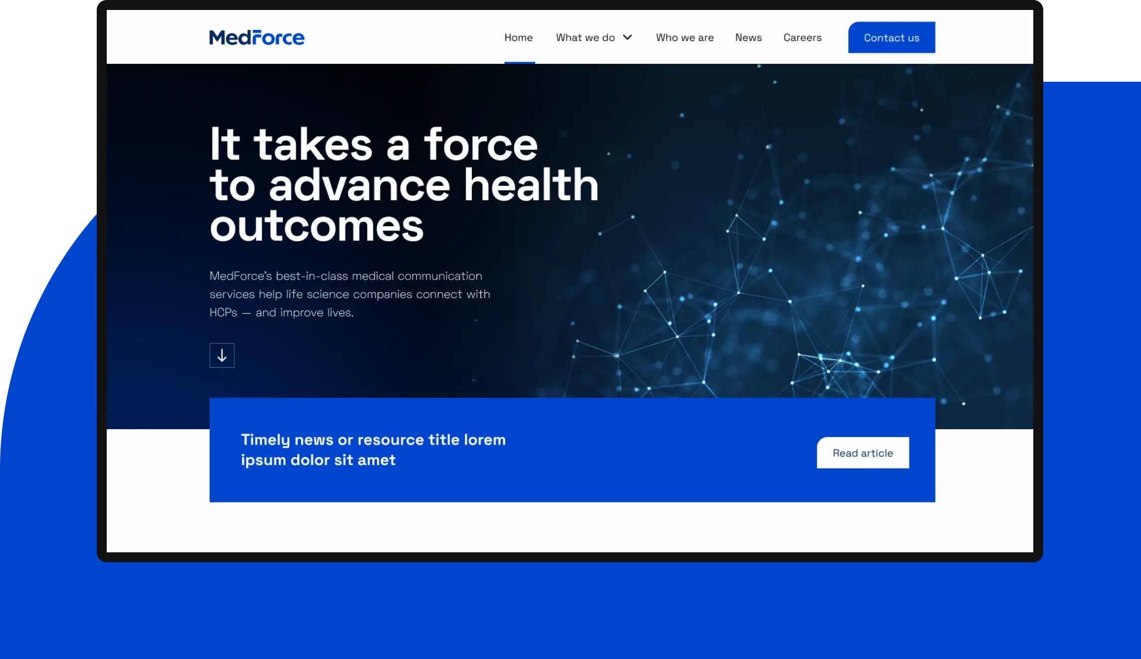
MedForce, medical communication conglomerate, asked us to update the branding and website for two of their brands. We set out to shine a unique spotlight on each brand, while also connecting them to each other.
The key insight
MedForce and Fallon Medica both provide medical communication services in different ways at different stages of a life science company’s process. So they needed to maintain separate brands and websites without feeling completely disconnected.
The bold strategy
We created shared design system that could flex for both brands. From a design and development perspective, it helped us quickly create two different websites. From a strategy perspective, it helped MedForce and Fallon Medica strike the right balance of similarity and distinction.
Two brands in one
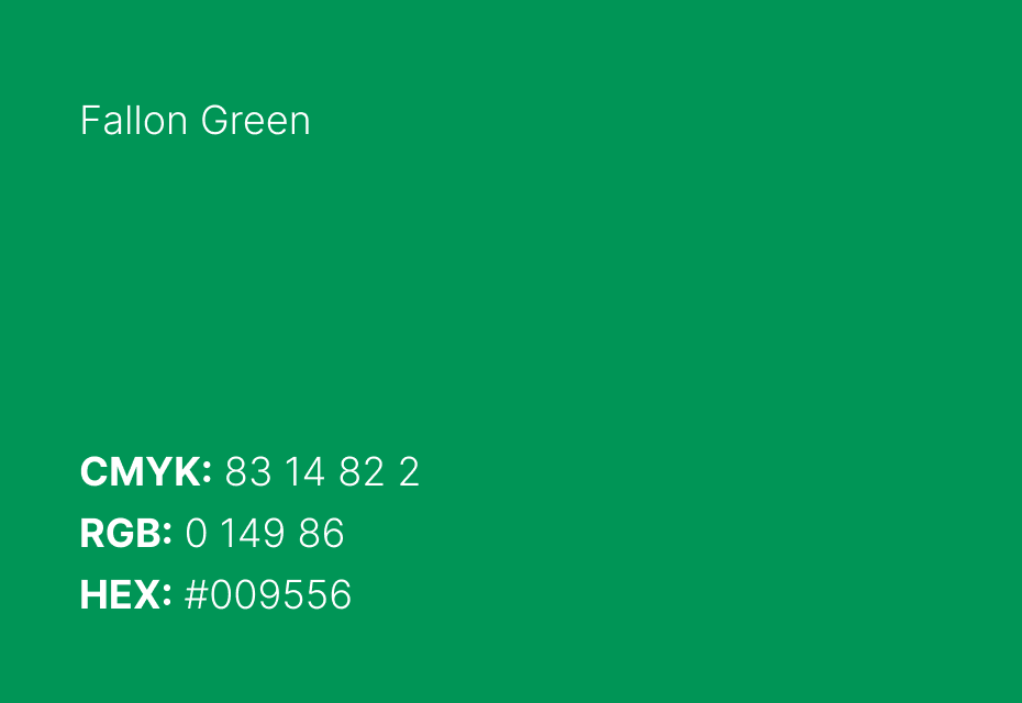
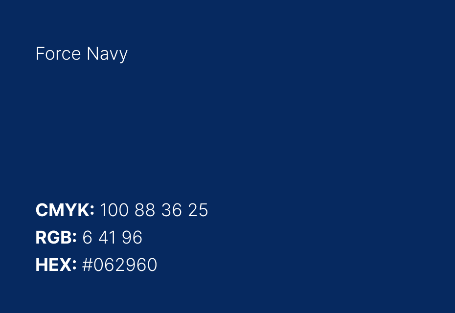
In creating the brand identities, we wanted them to be clear and unambiguous, so the names of each company had to be the focal point. The dark blue is a shared color, while the lighter blue and green help to set them apart. The most distinct element, the “F”, has a forward-moving feel of momentum or “force” — and we were able to leverage the curve as a design element throughout both sites.




A flexible template
We designed and developed a single template that both sites could share — with just enough customization to set them apart. The main focus of each site is to help prospective clients understand the services that MedForce and Fallon Medica provide and why their service is superior.
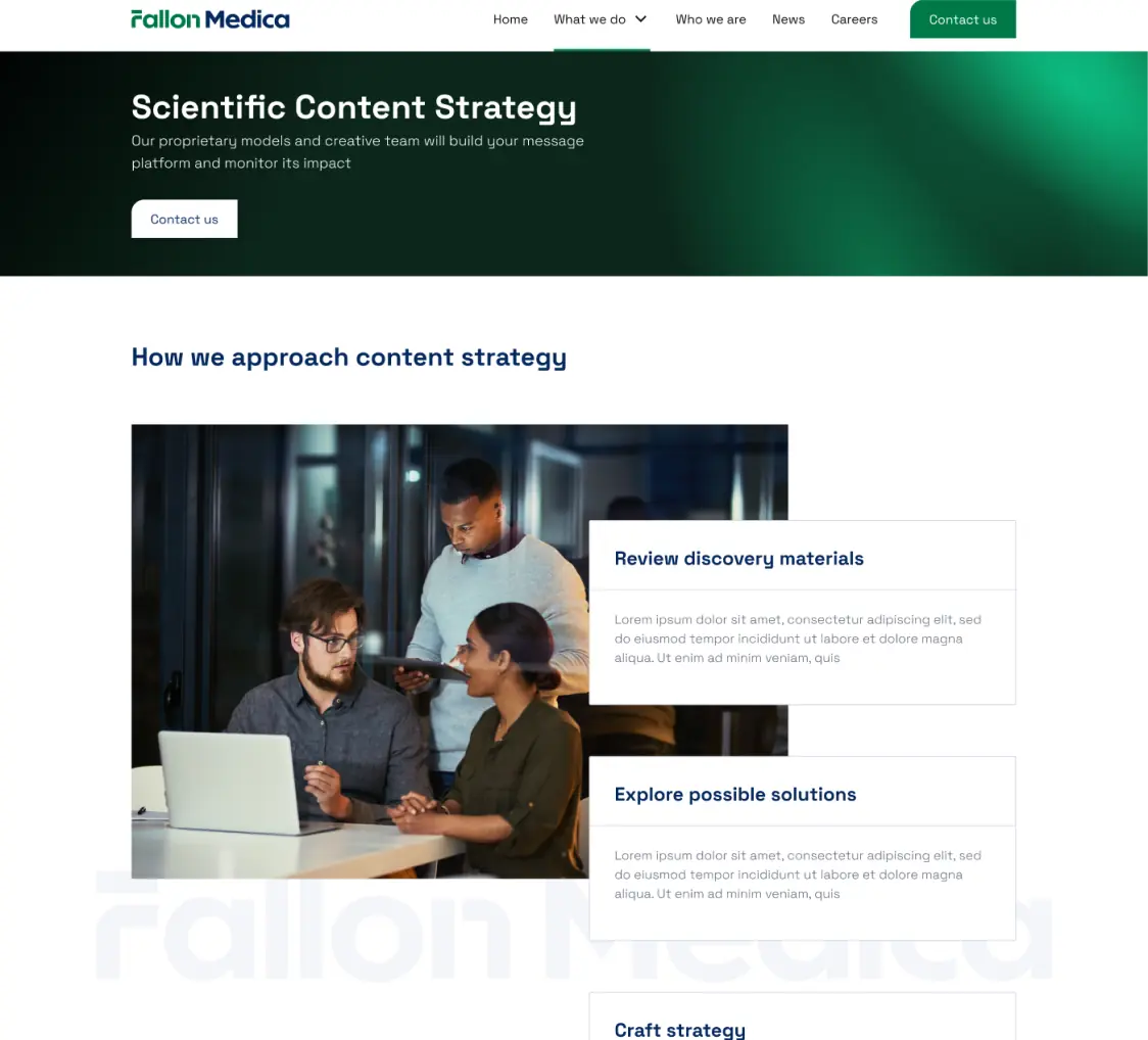
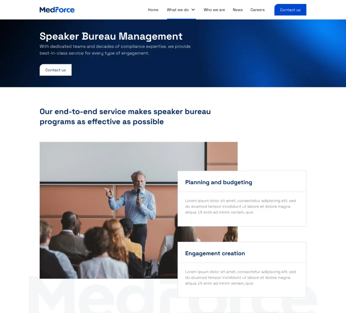
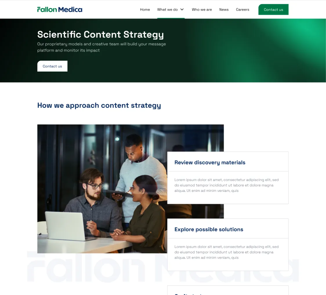
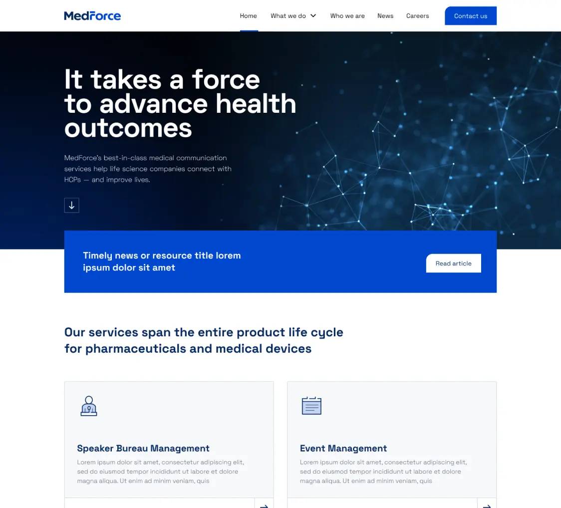
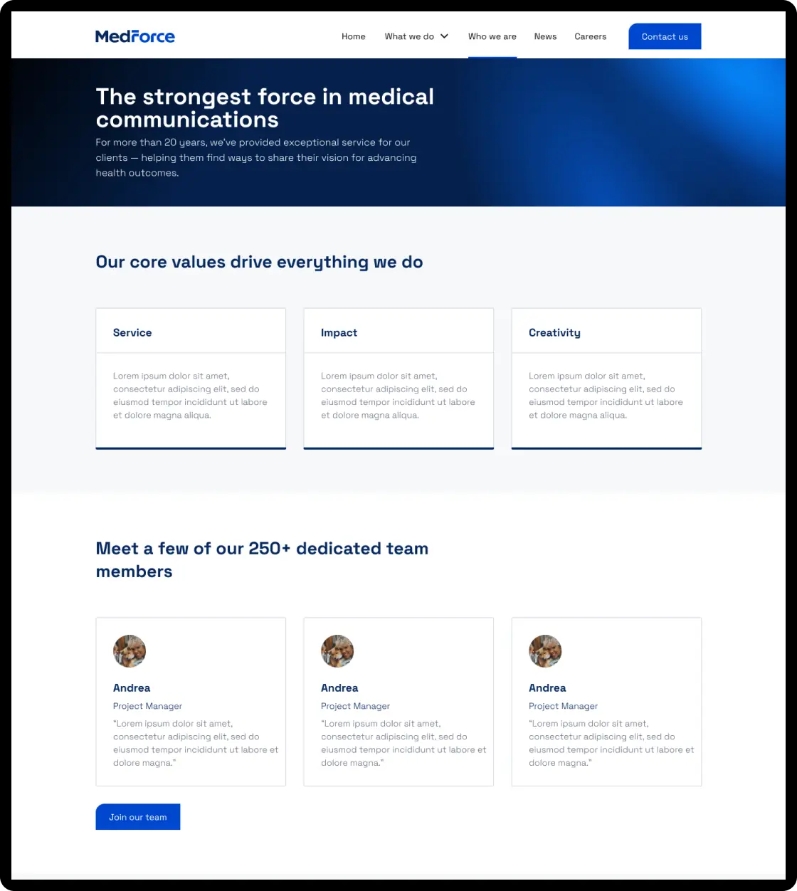
Emphasizing service through the people who serve
Both MedForce and Fallon Medica pride themselves on providing best-in-class client service. That’s only possible because of great people — people worth including on the sites. We made it a point to feature not only the leadership teams, but some of the other individuals who help these companies thrive.

Branding
- Brand strategy
- Messaging platform
Design
- Creative direction
- Website UI/UX
- Logo redesign
Development
- Web development
Content
- Website content strategy
- Website copywriting