Nova Credit
Newcomers to the U.S. were considered “credit invisible” upon arrival — until Nova Credit made it possible for them to transfer their foreign credit. They asked us to improve one of their products so that more users would complete the full process.

The key insight
For this product, users would apply for a credit card or loan through a third party, like American Express. After filling out their information and confirming their country of origin, they had one more step. That’s where Nova Credit came in — and where too many mobile users dropped, losing their entire application in the process.
The bold strategy
Considering privacy concerns, we had to make sure the introduction of Nova Credit felt credible. So we dialed up the emphasis on the partnership and explicitly called out security. And because this is an “extra step” after the application, we emphasized clarity and simplicity in the design to help users navigate through with minimal friction.
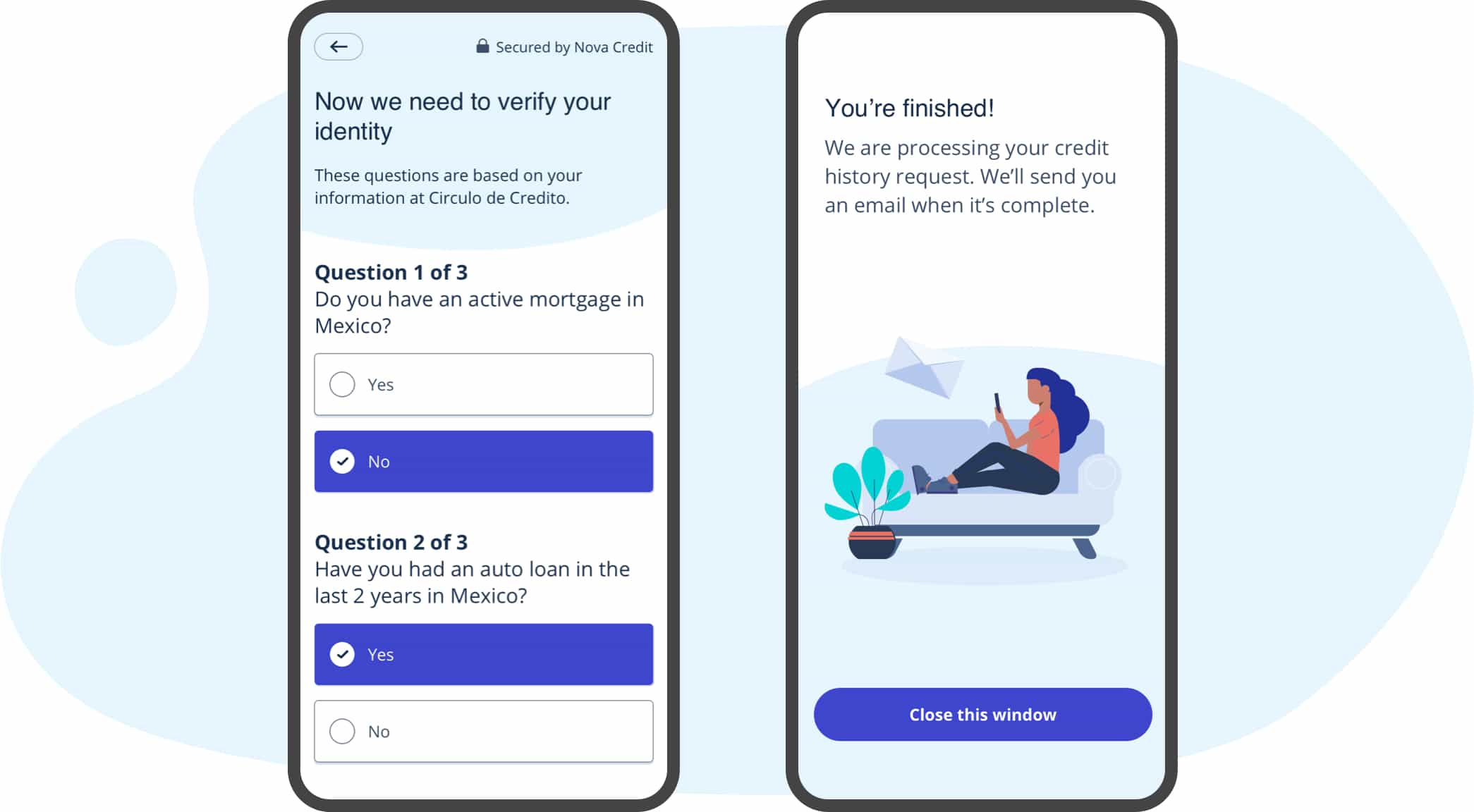
A subtle signature
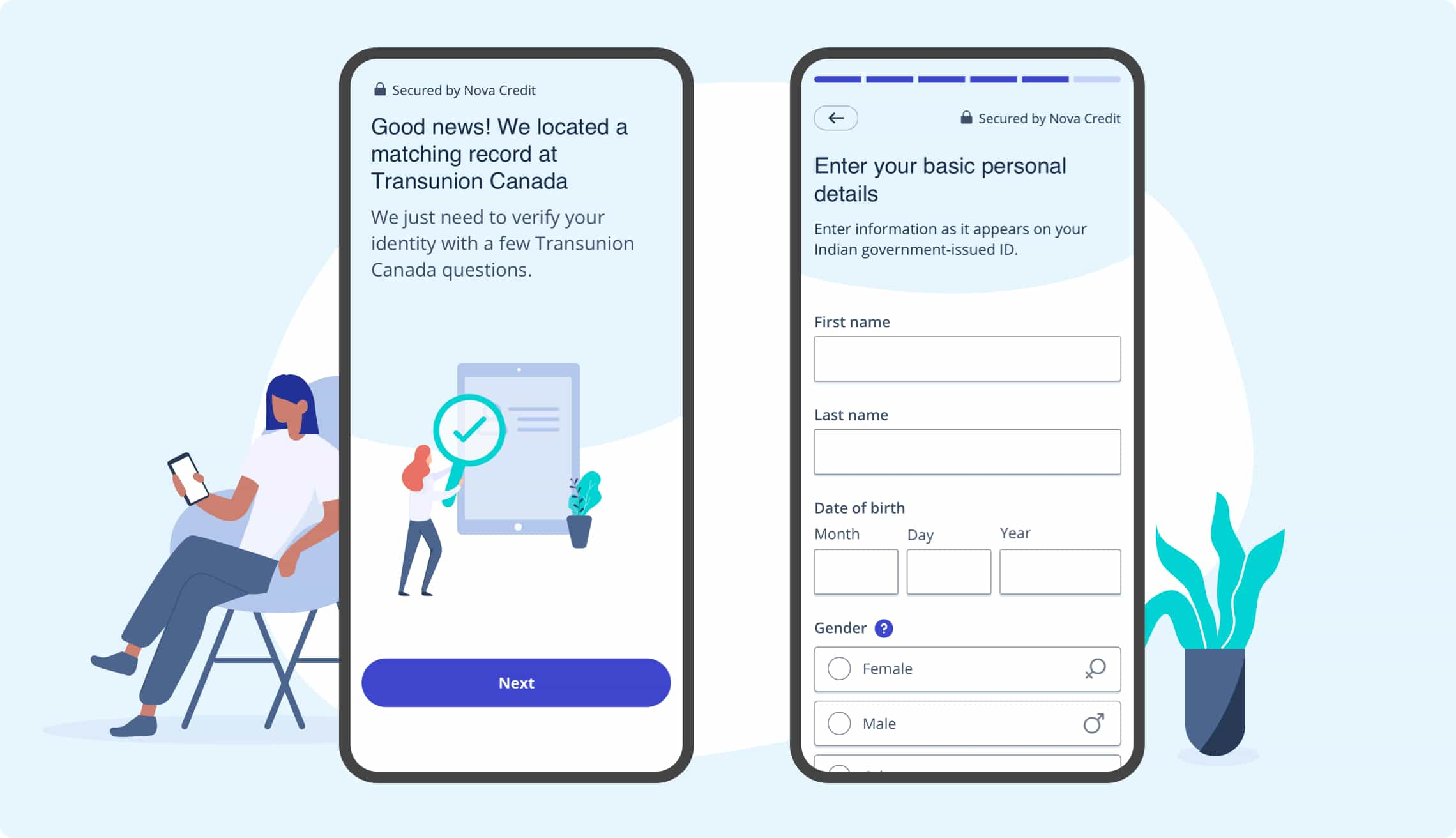
A consistent element of every screen is the curved, light-blue background. It adds just enough character to feel unique without demanding too much attention. The color also worked with Nova Credit’s brand guidelines and American Express, the most prominent partner.
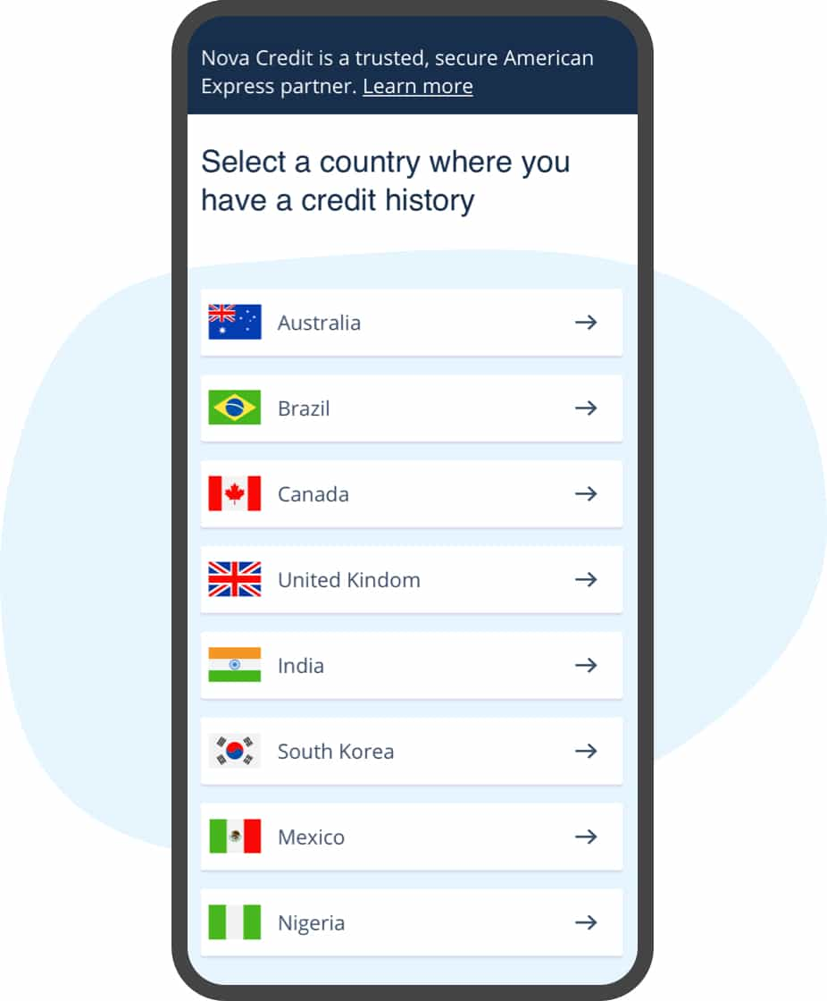
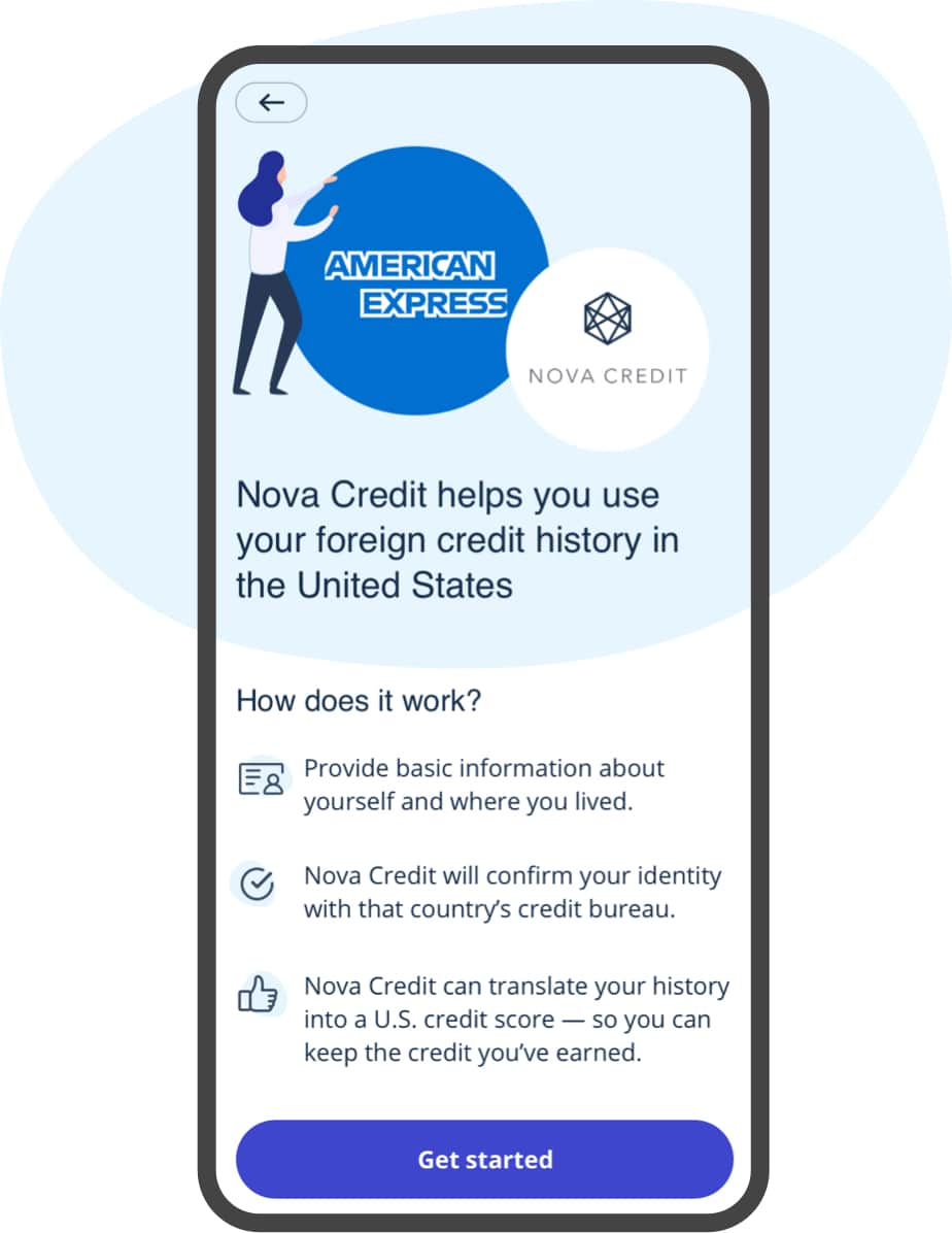
Clarity for the skeptics
On the first screen, users can select their country of origin or tap to “learn more” about the experience. That “learn more” screen needed to convince users to keep going. Between the design and the content, we had to make sure the entire process felt clear, credible, and easy.
It was a true pleasure working with Boldium. We worked with them on a major redesign of our core product, and they met our very high expectations. Their team was consistently thoughtful, responsive, and data-driven. I was impressed by the quality of their work, the depth of their expertise, and the collaborative spirit with which they approached our project.
—
The momentum of progress
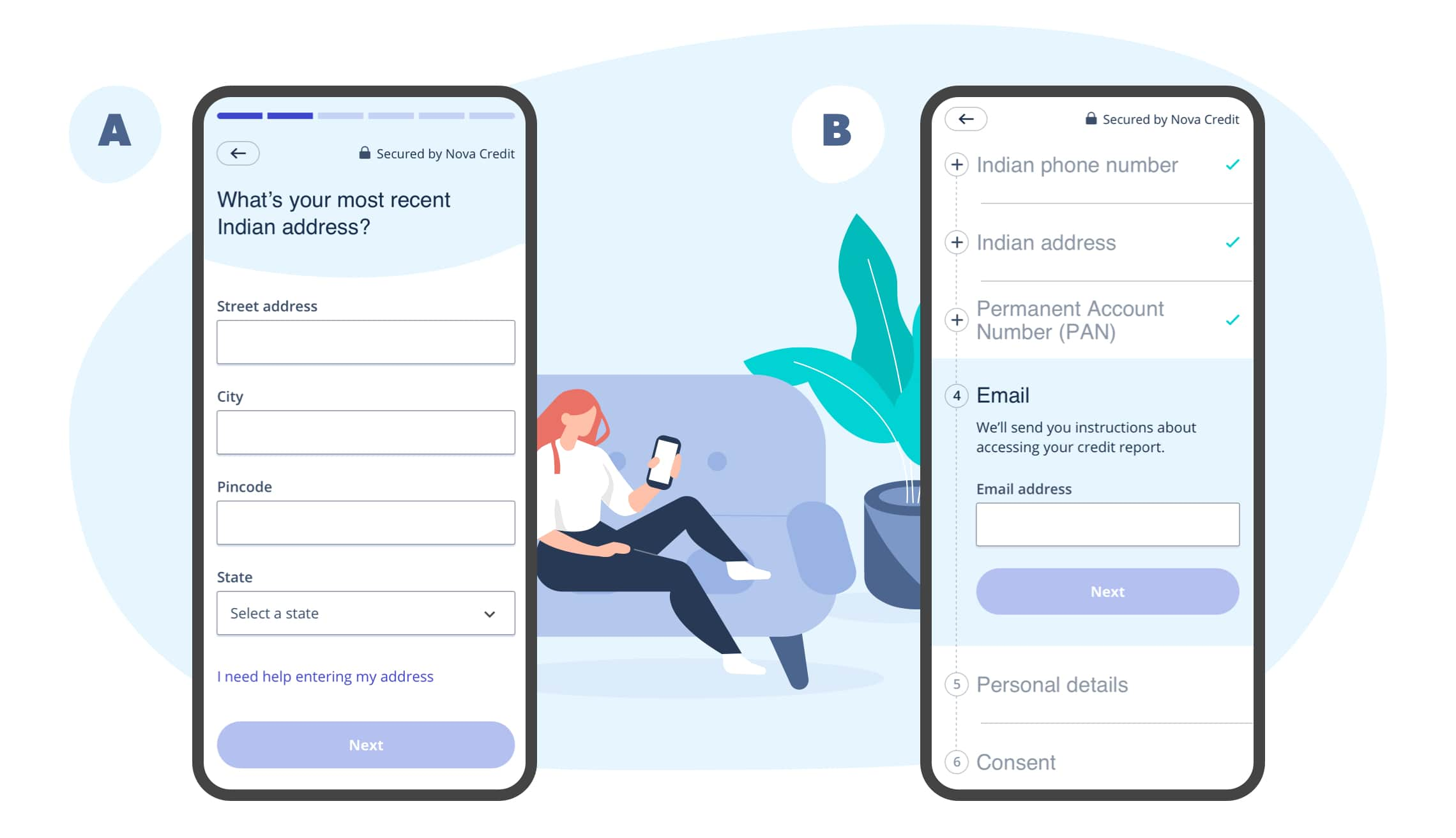
We provided two distinct approaches that the Nova Credit team could A/B test to give users context about progress. A more subtle approach had traditional bars at the top of the screen. A more aggressive approach stacked the entire flow and revealed every section’s headline.
Design
- Creative direction
- UX/UI design
- Design optimization
- Visual design
- Accessibility
Research
- Usability testing
- Qualitative interviews
- Quantitative research
Strategy
- Strategy pillars
Content
- Copywriting