On Lok
On Lok, a San Francisco-based non-profit, provides a wide spectrum of services for seniors. In fact, the services are so widespread that the brand felt spread out. They asked us to help establish the organization's positioning and conduct a rebrand.

The key insight
When we visited On Lok's locations, we were blown away by how deeply the staff cared about the people they were serving. They were living the lingo of “comprehensive care,” going above and beyond to care for every aspect of seniors' lives.
The bold strategy
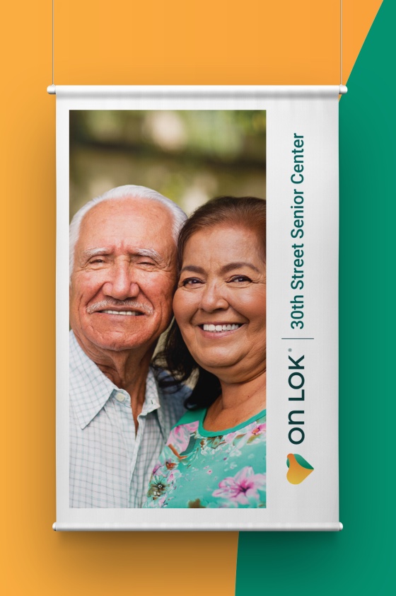
Unifying all of On Lok’s sub-brands would help communicate more powerfully the incredible comprehensive care they deliver. The key would be to evoke the incredible warmth of the staff with the professionalism and innovation the company has displayed over its 50 year history.
A brand with both heritage and innovation
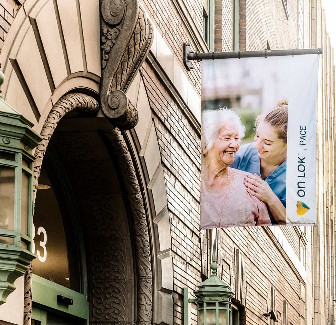
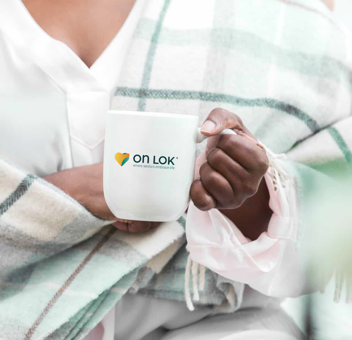
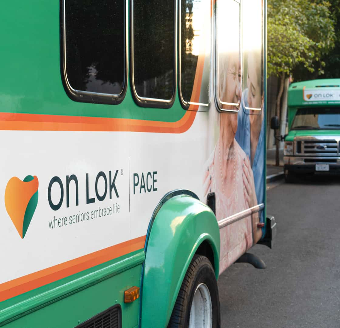
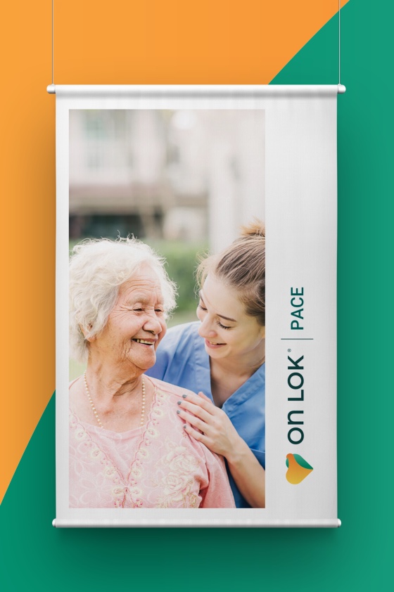
On Lok has an incredible history. They were the ones who literally created the legislation for PACE, an innovative system of healthcare offered across the country. To keep a tie to this history, we maintained the same primary color, which we named "spry green", but we added a gradient to give it a more active, innovative feel. In addition, we introduced an orange gradient as a primary color to imbue the brand with warmth and dynamism.
Making a logo stand out
Good logos are memorable. Great ones emotionally connect with a brand's core. For On Lok, the core brand pillars we helped define are: a pioneering spirit, highly personalized care and compassion, and connection to community. To evoke the brand's care and compassion, we used the universal symbol for love, a heart. But we also designed a signature On Lok embrace within the heart to make it memorable and uniquely tied to On Lok. The embrace is a gesture of personal care, a connection to community, and a link between the medical, professional side of On Lok and the warmth and compassion of everyone from van drivers to dance teachers.
Boldium were excellent strategic partners who took the time to truly understand our organization and services. They helped craft a stunning brand identity that conveys our compassion and expertise in serving seniors. They continue to be our trusted partner for critical branding projects.
—
A tagline that feels like an embrace
Creating a tag line is both highly strategic and delightfully poetic. Quite early in the process, it became clear that the strategic pillars all pointed to the word embrace. But it wasn't until we were in a brainstorm session together with our On Lok partners that the pieces of the puzzle all fit together just right. The room instantly become energized. It's a moment none of us will ever forget. Where seniors embrace life.


We also helped to design and market a health coaching program for On Lok. When we interviewed seniors who had recently been in the hospital, two things became clear. First, many people feel ashamed to ask for help. And second, people deeply appreciate small bits of encouragement. Hence, we anchored the program around the idea of getting help with navigating the healthcare system, something everyone recognizes as a problem, and hence less shame provoking. And second, we tried to inspire people with the powerful feeling of having someone there to help you feel your best.

Branding
- Brand strategy
- Logo redesign
- Tagline
- Visual branding
Strategy
- Strategy pillars
- Feature roadmapping
- Information architecture
Design
- Creative direction
- Visual design
Research
- Qualitative interviews